
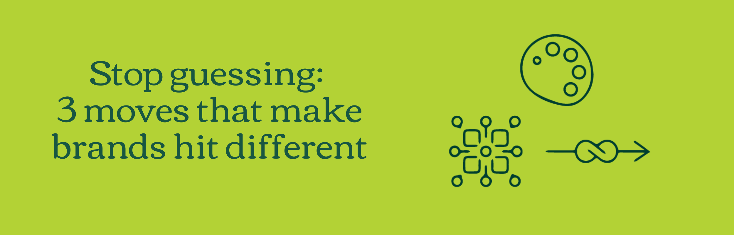
Stop guessing: 3 moves that make brands hit different
Over the years, as people who build brands from scratch daily, we’ve noticed patterns in the brands that actually work, and yeah we mean “actually work.” It’s the ones that feel alive, memorable, and unmistakably unique that you have a sense of feeling when you think of their brand.
There’s no magic formula, but three things consistently show up in every brand that communicates its story well. These aren’t just surface-level observations, they’re the strategic and visual choices that separate forgettable, generic, boring, copycat brands and ones that feel alive, engaging, unique, and full of “ah-mazing” energy.
1. A Strategic Thread That Holds Everything Together
Firstly every brand that works has a story guiding it. Their story is strong. Not a vague mission statement or just some key values tucked away somewhere to say we’ve done it, but rather a real story that shapes every single choice that transcends internal and external brand impression.
No story, no spine. Simple.
When a brand strategy is strong, every touchpoint feels deliberate. You can trace a line from the founder’s vision, brand personality, to the messaging, to the visual identity. That thread is what makes a brand coherent, even as it grows that thread is visible. Without it? The brand feels scattered, like a collection of nice ideas with no backbone or a chameleon that changes colour every five seconds.
Brand tip: Before getting to anything, ask: What story am I telling? What do I want to be perceived as in the market? Everything else flows from that. And if you can’t answer it clearly, nothing else will stick.
Bonus tip: When multiple stakeholders have a finger in the brand pie, firstly get everyone aligned on the story first, way before logos, colour, or campaigns. Use that shared story as your “north star” so every decision has a single point of reference and a singular direction on the compass. It keeps the brand coherent, even when everyone wants a piece of the pie and it threatens to fall apart.

2. A Custom Visual Language That Feels Irreplaceable
Visuals and Illustrations aren’t just pretty decorations, they’re a language that is used to communicate. Visual languages have been used for millennia, from Egyptian hieroglyphs and Chinese calligraphy to medieval stained glass to now more modern brands, to convey meaning, personality, and story without a single word.
The brands that stand out don’t settle for stock photos or designs that don’t have meaning. They have an individual visual language style that only they could own, one that communicates their story without a single word.
Generic is forgettable. Custom is everything.
Patterns, colour palettes, illustrations and shapes working together, this is what makes a brand impossible to forget. It’s not just recognition, it’s identity. And if you are thinking your logo is going to do the heavy lifting then you are in for a surprise, it’s only one element to your brand, it’s an important one, but brands need to look at the full picture of visual language.
Brand storytelling tip: Make it yours. Go through all your assets, or notice what’s missing and ask yourself: is there a common style, what’s the story I’m telling? What’s the thread that ties everything together? Are you relying on generic stock images or designs that don’t actually communicate meaning, or are you just hoping for the Australian colloquial term “she’ll be right”?
Be intentional. Every visual choice should reflect your brand story and personality, not chance or wishful thinking.

3. Consistency That Starts With the Story
Consistency isn’t about rigid rules, it’s about clarity. The brands that communicate well are consistent because they always come back to the same story. Every design decision, piece of copy, and touchpoint reflects that core narrative.
Consistency is the quiet power move.
We’ve seen brands with gorgeous visuals that still feel disjointed, beautiful but forgettable. It’s the meaning that really connects and transcends communication. When strategy, visuals and illustration are aligned, consistency isn’t forced. It’s natural. And trust? It follows almost automatically.
Brand tip: Consistency isn’t just what you repeat, it’s what shows up across everything you create. Go through all your assets, your website, socials, packaging, emails, and see what actually feels consistent. Ask yourself, “what areas are you struggling with consistency?”
Bonus tip: Brands that work aren’t accidents. They’re built on a clear story, custom visuals, and story-driven consistency. Miss one of these, and your brand is just another “nice” logo in a sea of noise.
Ask yourself: does everything I do tie back to the story I want to tell?
If the answer is no, it’s time to tighten things up, because brands that work don’t leave this to chance. They are intentional, meaningful and have a sense of purpose. Every element is a strategic asset that shapes perception, builds trust, and drives connection. Strong brands recognise that their identity impacts both internal teams and external audiences, influencing culture, reputation, and business outcomes. When your brand is treated as a deliberate, living asset, every decision, from visuals to messaging to experience, reinforces its value.
Ready to make your brand work? Start by clarifying your story, aligning your visuals, and committing to consistency. If you’re serious about creating a brand that’s memorable, meaningful, and unshakably you, let’s talk.
Quick check
How does your brand stack up?
Tick the ones that genuinely apply to your brand right now — be honest.
Strategy
I can clearly articulate who my brand is for, what it stands for, and why it exists
Not just in my head — in writing, in a way I'd share with a designer or new hire.
Visual language
My logo, colours, fonts, and imagery feel intentional and cohesive — not pieced together over time
Someone could look at my visuals and immediately understand the kind of business I am.
Consistency
My brand looks and sounds the same across my website, socials, proposals, and printed materials
There's no version of my logo I'm slightly embarrassed by somewhere.


NEXT STEPS
Book a brand audit
A brand audit is a structured review of all three pillars, where your brand is strong, where it's inconsistent, and exactly what to fix first.
What’s included:
A detailed written review of your strategy, visual identity, and consistency across touchpoints.
To start off we have a high level questionnaire to fill in.
We organise a 15min video call to chat with you to understand brand challenges and any nuances missed.
A comprehensive brand audit document detailing challenges, visual, strategy, messaging etc.
Specific, prioritised recommendations, not vague advice
A 20-30-min walkthrough video showcasing
Want to get all the juicy goss about branding and illustration straight to your inbox?
Sign up for the newsletter and receive monthly newsletters!
Just like Mr Magorium’s Wonder Emporium, where we share a variety of (branding and illustration) tips that bridges the gap between designers and business owners.