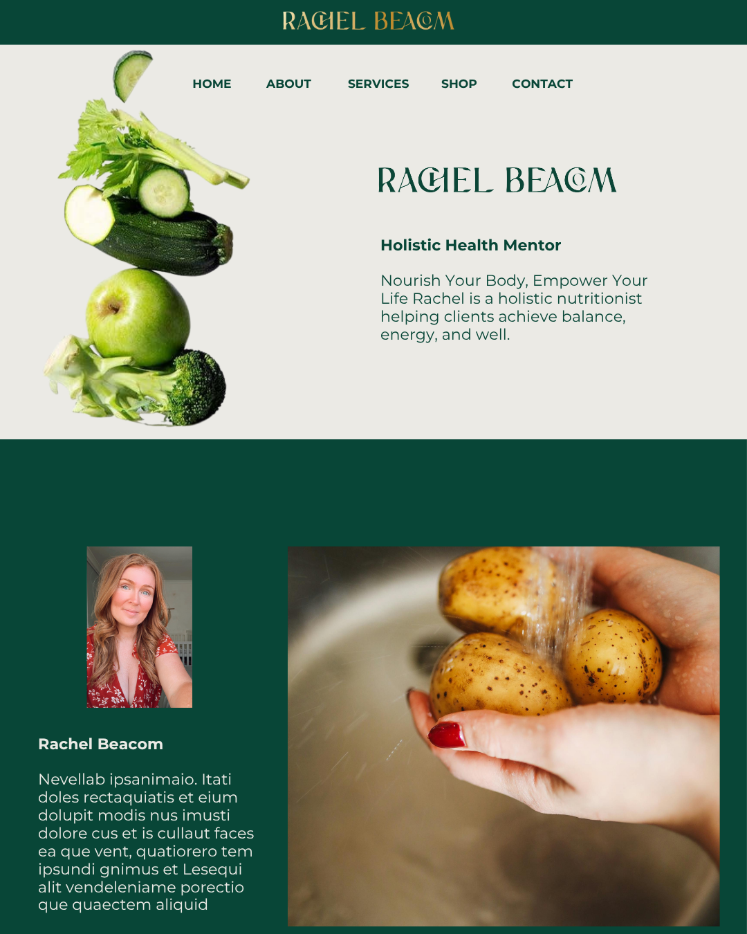
Rachel Beacom
Brand Identity
Rachel Beacom is a Holistic Health Mentor who empowers busy mums to take control of their health naturally, simplify wellness, and nourish their families. Drawing from her own health journey and experience as a mother of six, she offers simple solutions and a supportive community to help women thrive naturally. Her brand focuses on conscious living, toxin-free choices, and holistic healing. Read about Rachel Beacom by scrolling through our International Womens Day interview with her on our blog.
-
Brand Identity
-
Rachel Beacom:
One-on-one holistic health mentoring (for busy mums)
Programs focused on hormone balance, gut health and natural wellness
Simplified, sustainable wellness plans (navigating motherhood, health and self-care)
Supportive community and accountability for women keen to thrive (not just survive)
-
Qualified Holistic Nutritionist
-
Health + Wellness
-
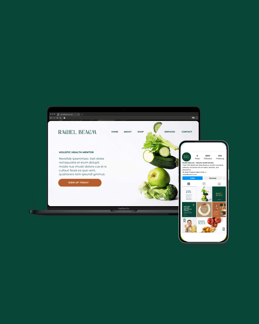
Visual Brand Identity
Creative direction concepts
Logo suite
2 client revisions
Colour palette suite
Typography suite
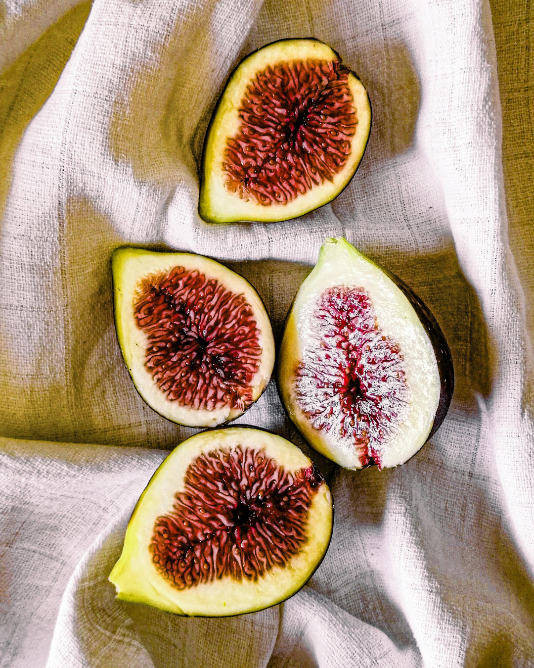
Image treatment
Style Sheet
Export handover of relevant files.
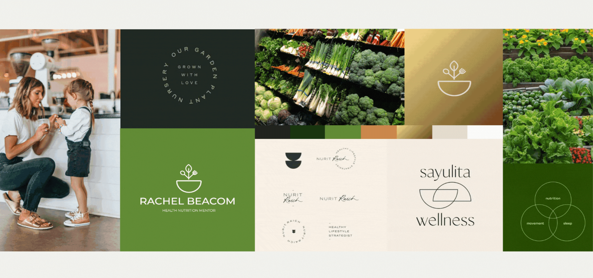
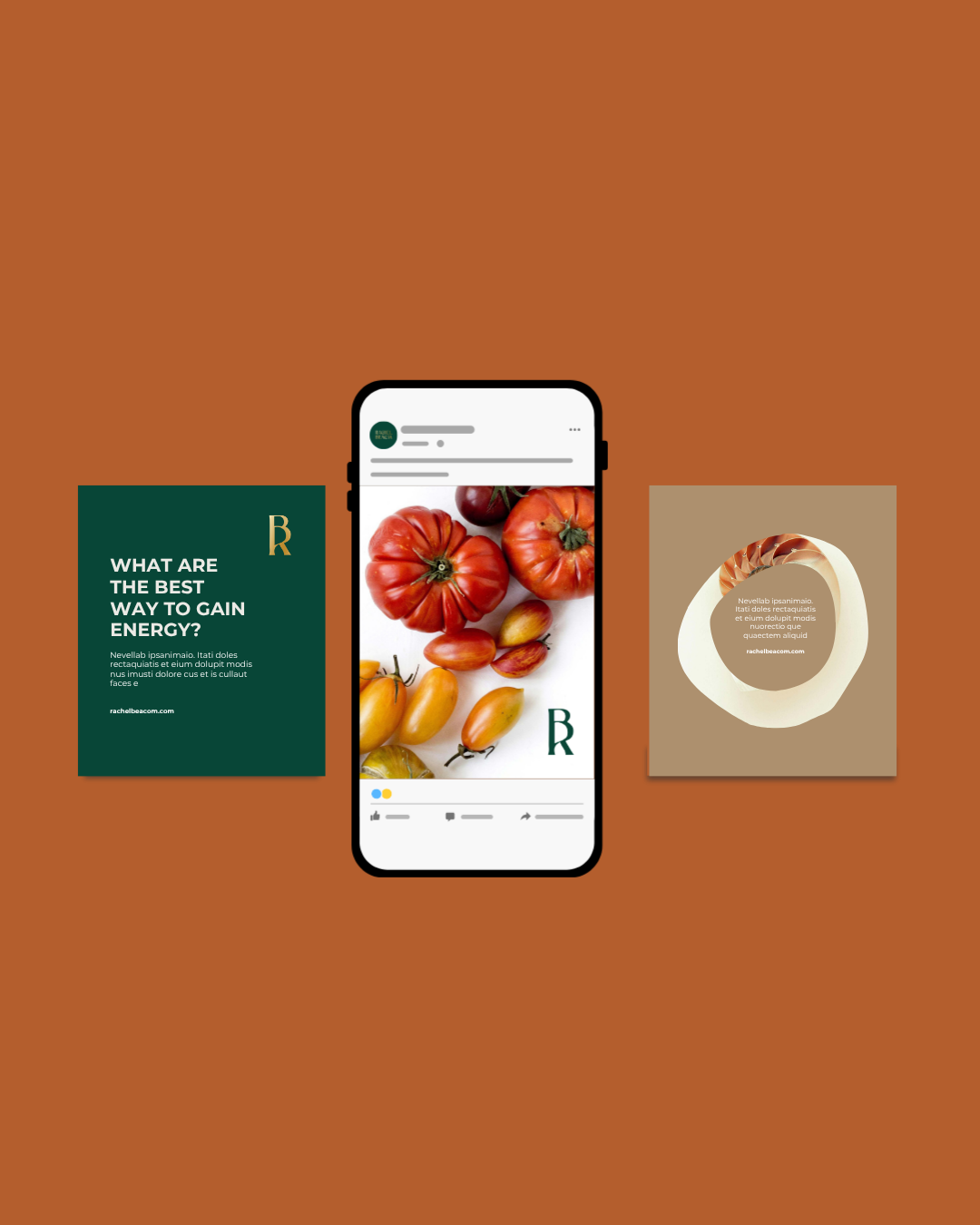
Stylescape Creative Direction Boards (3 Concepts)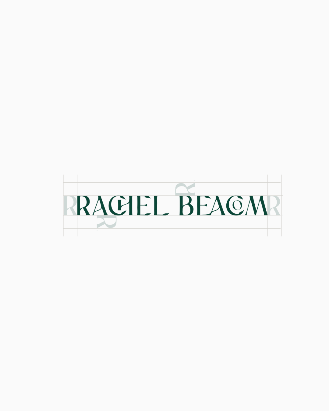

From empathy mapping to creative direction, stylescape exploration, concepts, and final brand development.
When we set out to create Rachel’s brand, our goal was to capture her calm, approachable, and holistic philosophy in a visual identity that felt authentic and relatable. We started by diving deep into the audience, busy moms prioritising their health, families with neurodivergent children seeking to understand how food affects behaviour, and individuals who already embrace a natural, wholesome lifestyle. Using empathy mapping, we explored these target audience needs, motivations, and daily lives to ensure every design decision would resonate.
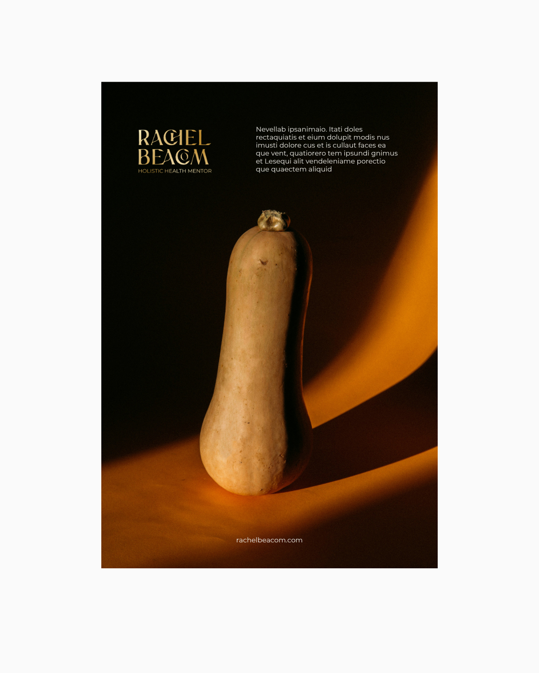
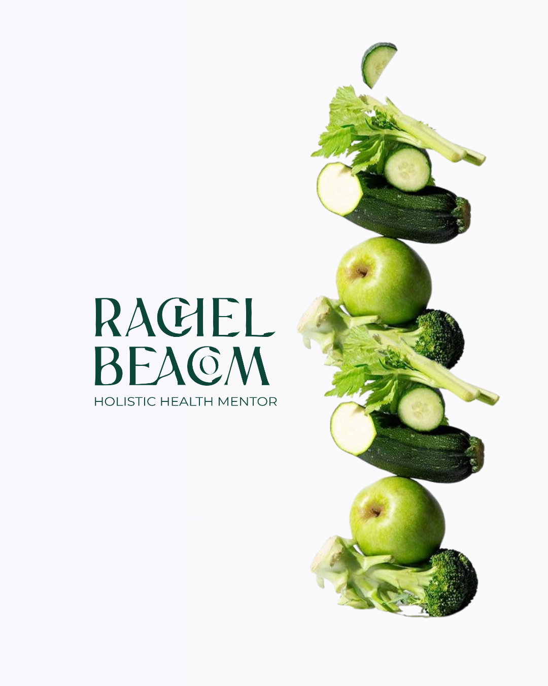
From there, we began the foundations of the brand, defining its identity and overarching creative direction. We explored three distinct style scape boards, each offering a unique visual path. Concept one embraced deep burnt orange and brown tones, with an organic, curved logo and fruit-inspired graphics emphasising growth and connection. Concept two featured a lighter, brighter palette of blues, soft browns, and green-beige, with a leaf-inspired logo, subtle nutrition elements, and creamy, understated visuals. Concept three used bold greens, gold, and orangey-burnt tones, with a logo depicting a bowl, leaf, spoon, and fork, paired with iconography inspired by nutrition and health.
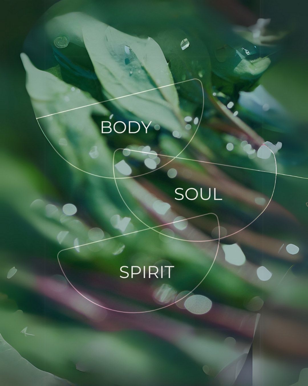
The core values of the brand family, nature, connection, simplicity, holistic living, and authenticity.
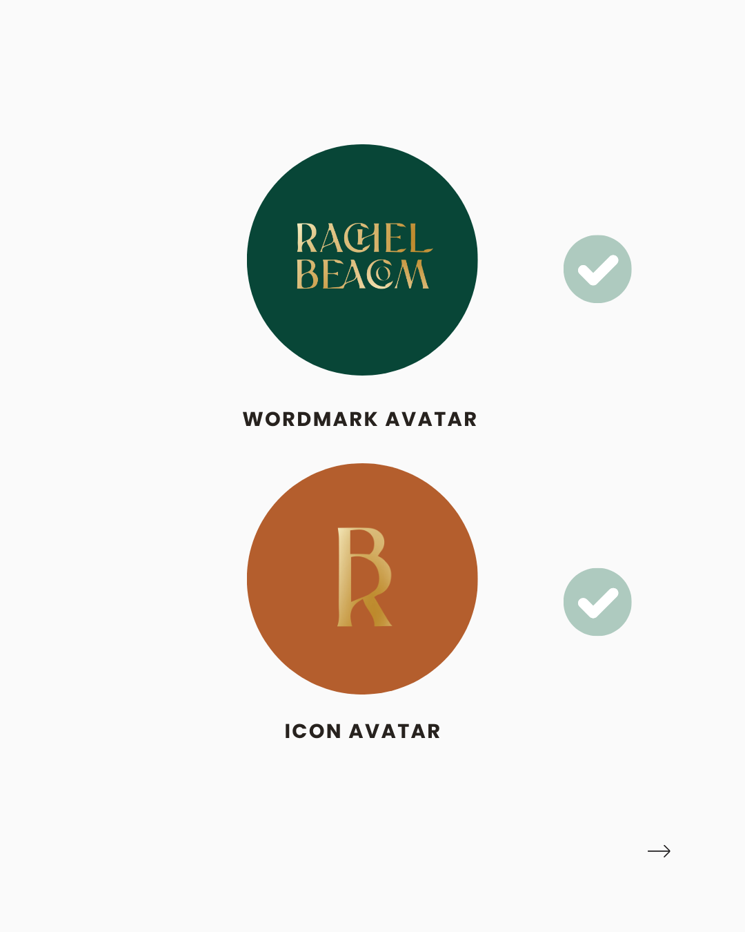
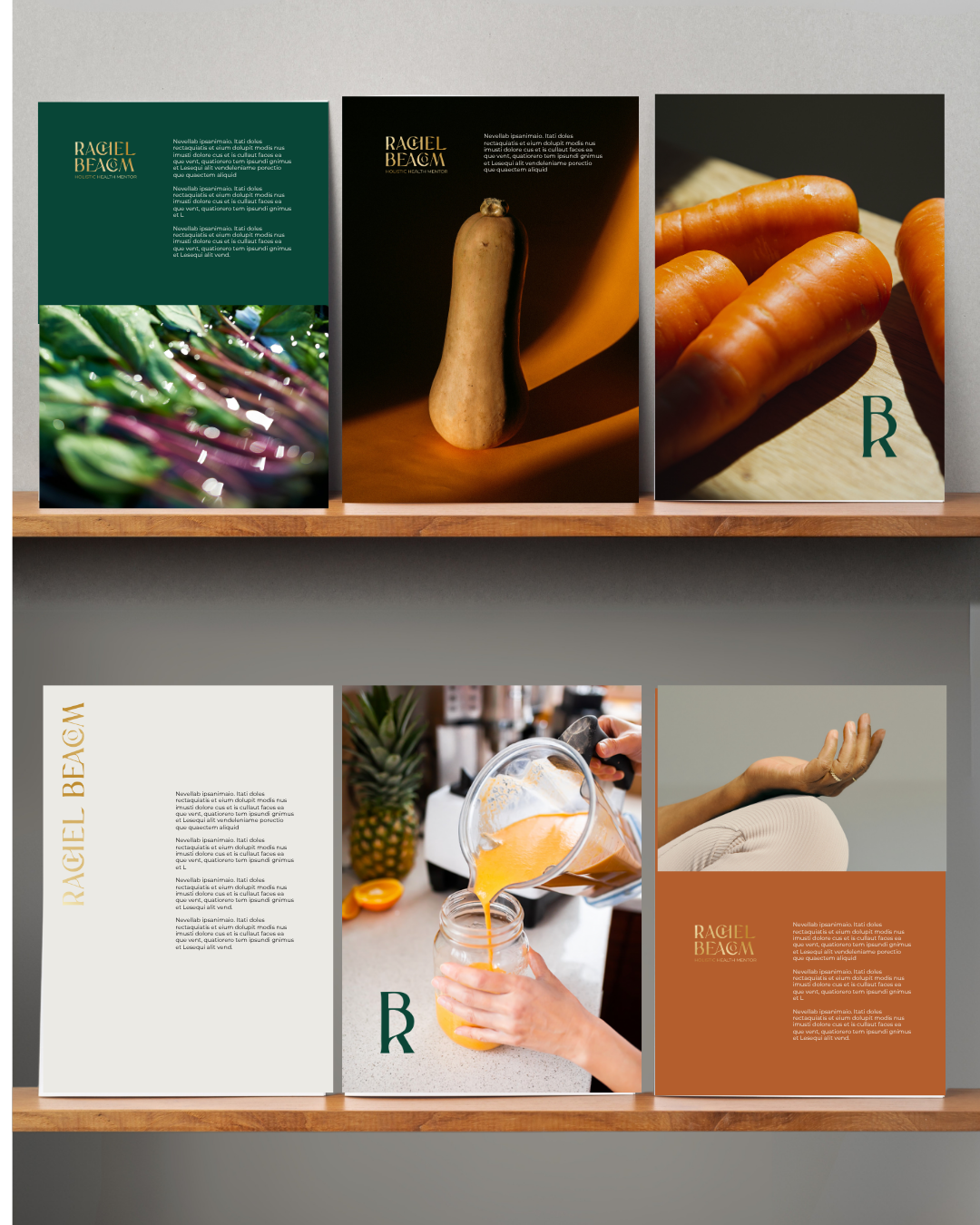
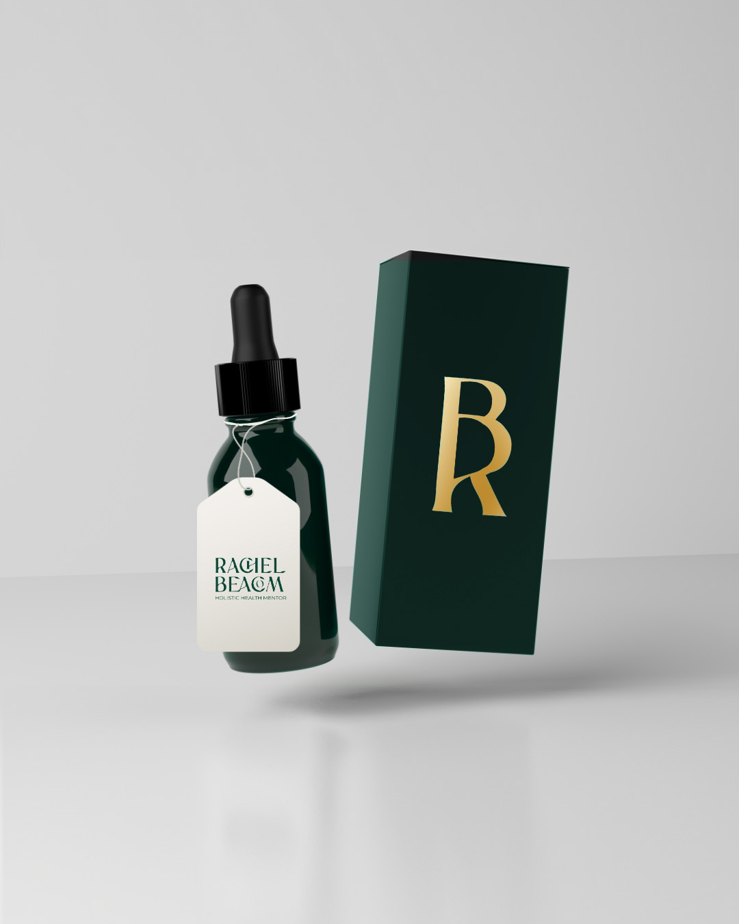
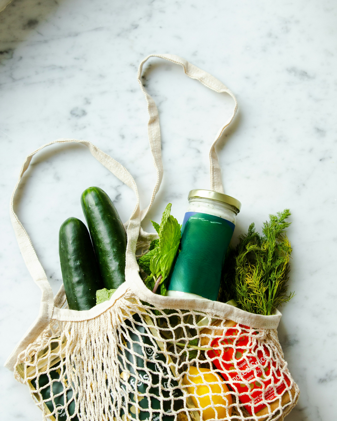
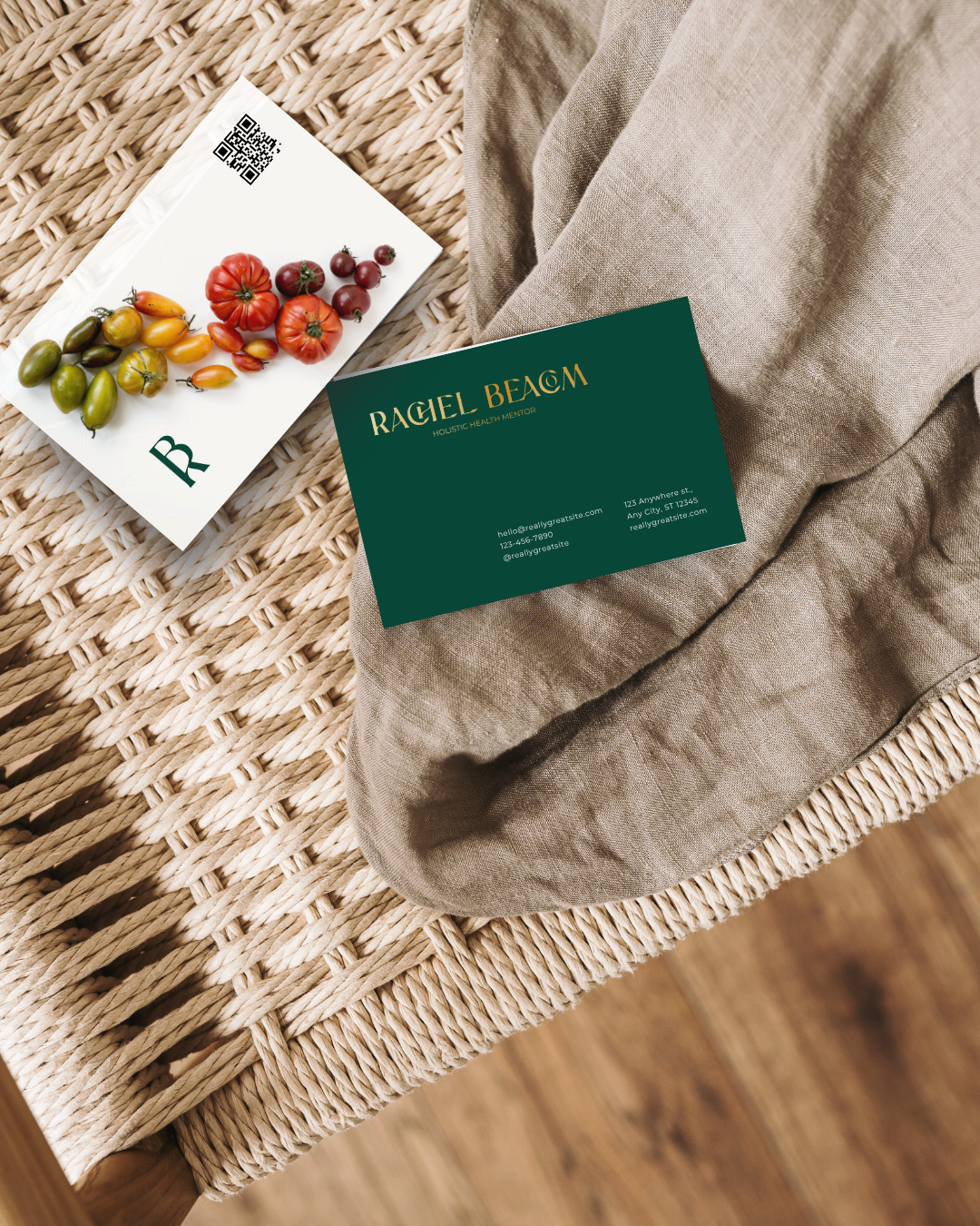
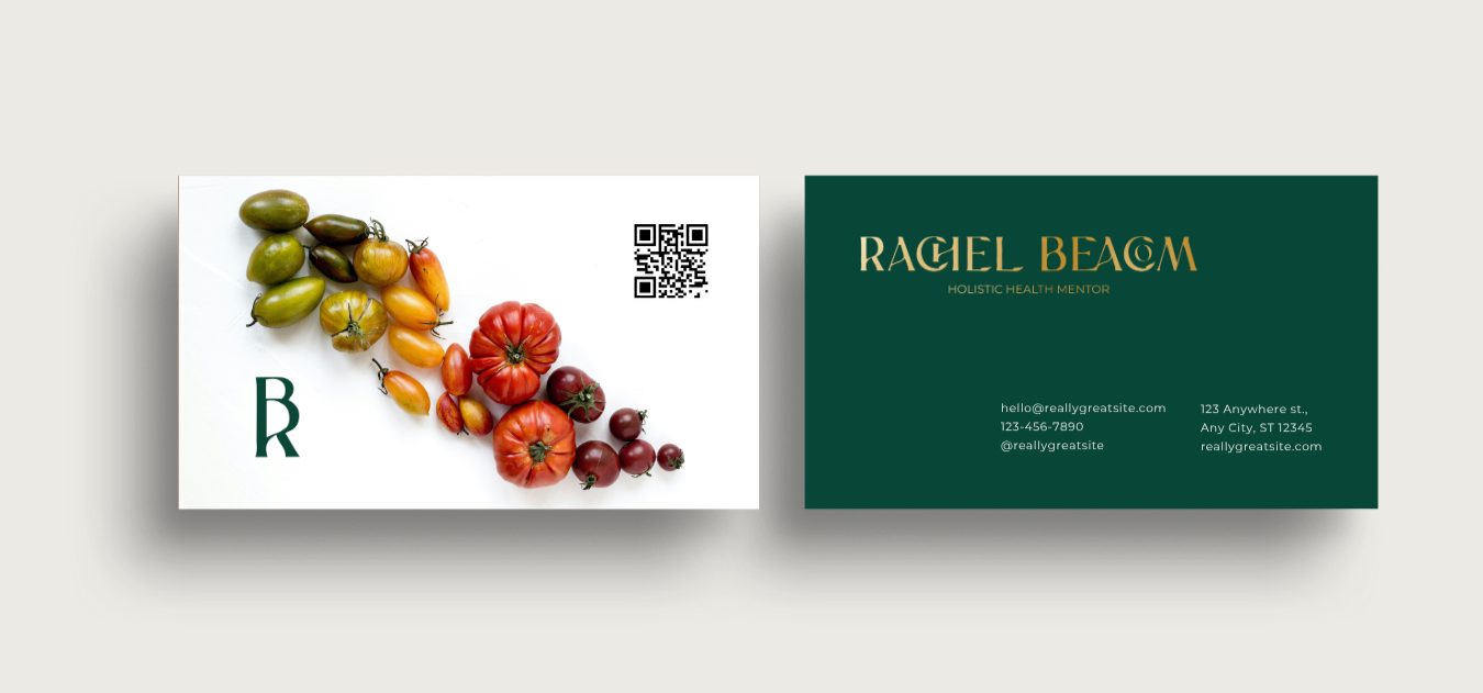
When developing the brand, we considered the core values, the target audience alongside how the brand could be easily managed. We used simple food-based imagery, using either selected stock images or photos taken by Rachel herself, to simplify visuals and make them easy to apply. We included image brand guidelines for consistency. The logo combines the letters ‘R’ and ‘B’ in a curved, down-to-earth typeface that remains simple, professional, with a subtle nod to Rachel’s Irish background. We wanted the brand to extend seamlessly across packaging for future brand growth, so incorporating a subtle sub mark and strong logo was important.
After reviewing the various style scape boards, one concept was selected, with certain elements from other concepts merged in to create the final direction. Along the way, we refined the colour palette, selected typefaces and typographic hierarchy, and iterated through several rounds of concept exploration and revisions. The process concluded with a comprehensive brand style sheet outlining logo usage, colour, typography, and key guidelines for ease of use.