
Evolve Capabilities
Brand Identity
Evolve Capabilities is a Canberra-based consultancy that designs bespoke Business Management Systems (BMS) to align strategy, people, processes, and technology. They help organisations simplify complexity, transform change into opportunity, and build systems that work for the people behind them.
Their approach blends business architecture, process modelling, platform integration, and user experience design, creating unified systems that drive clarity, connection, and meaningful work. Grounded in purpose and community, Evolve helps businesses not just adapt to change, but lead it.
-
Brand Identity
-
Evolve Capabilities:
Business Management Systems architects.
Technical Writing,
Intelligent Modelling,
Creative Media Sharepoint Solutions
Platform Integrations
Custom Design
-
Bespoke Business Management Systems
-
Defence Industry
-
-
Visual Brand Identity
Creative direction concepts (4)
Logo suite
2 client revisions
Colour palette suite
Typography suite
Type hierachy
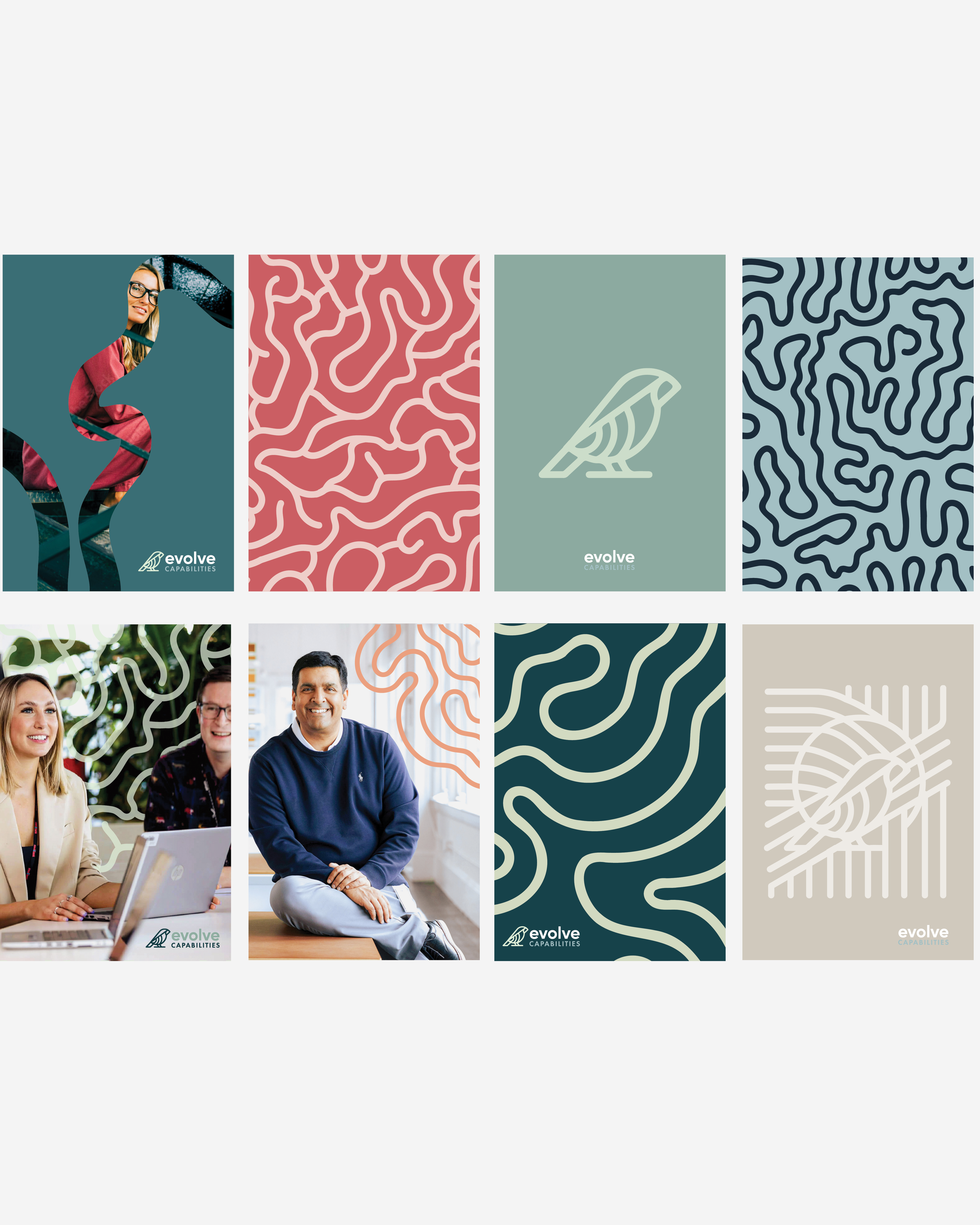
Supporting graphics
Background textured images
Image treatment
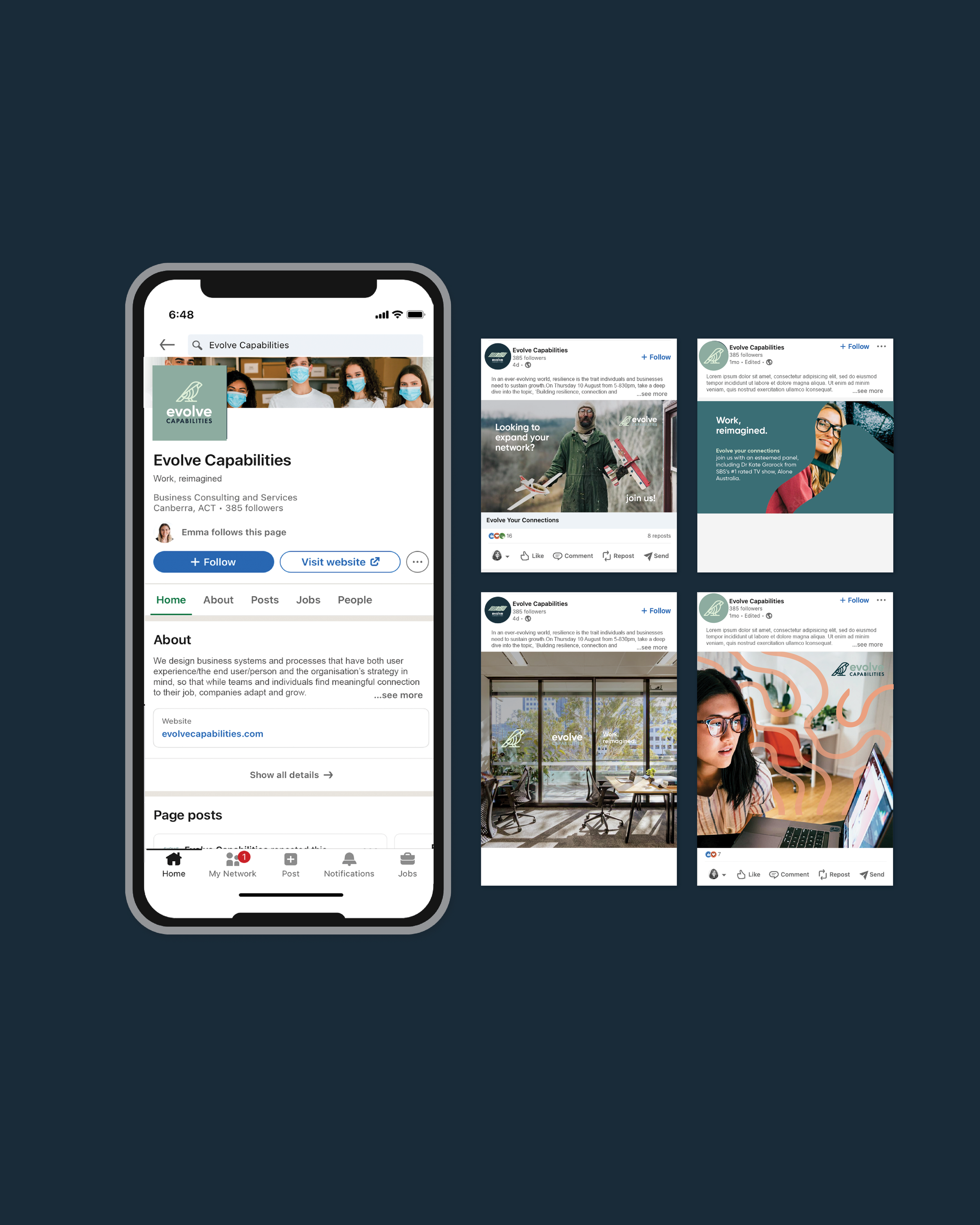
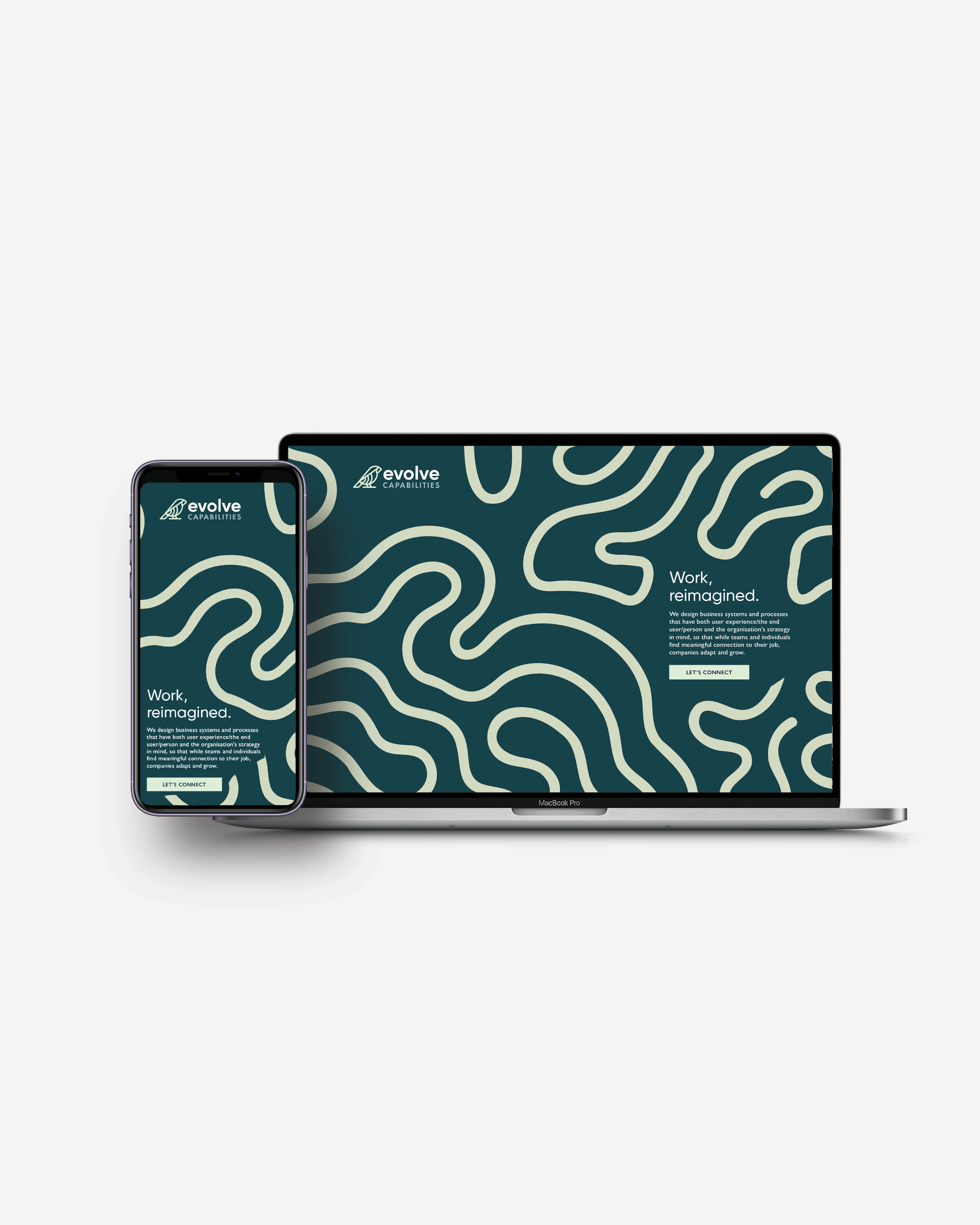
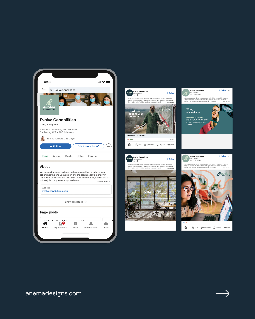
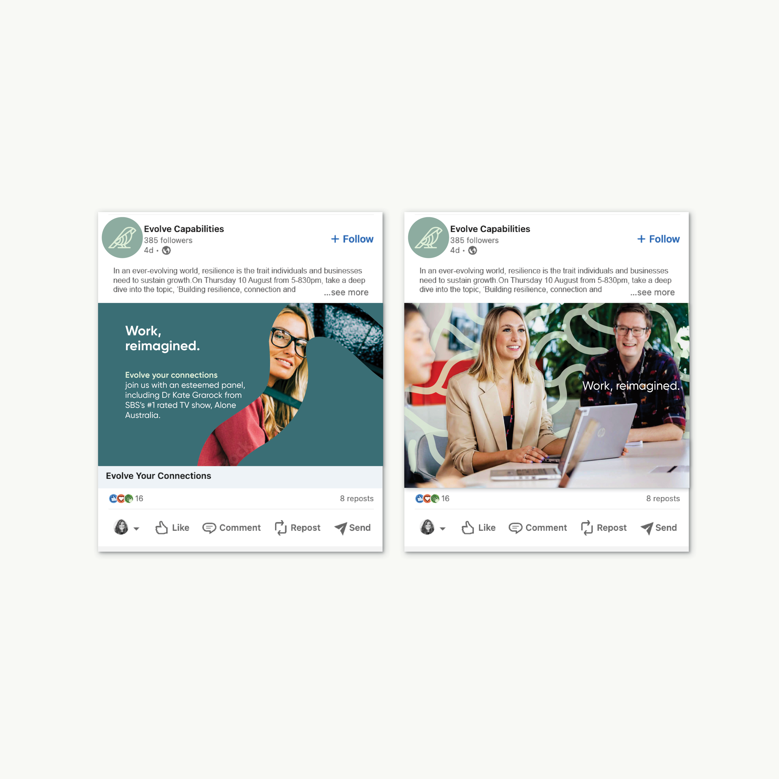
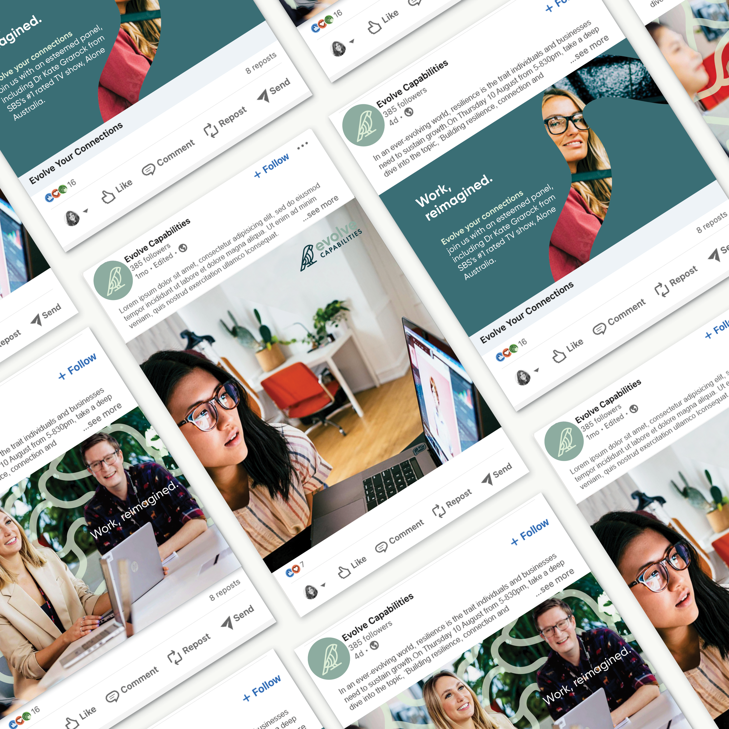
Brand application on website, Linkedin, publications
Comprehensive brand guidelines (20+)
Export handover of relevant files.
Collaborating with brand strategist, copywriter brand messaging

It all started with initial concepts, based on the brand strategy.
We proposed a couple of different directions and concepts to meet the brand strategy.

Concept One: The 5 lines represent the 5 core pillars and signifies motion, progression, and transformation. The lines represent an active and dynamic brand, conveying excitement, continuous progress, adaptability, and a drive to push boundaries. A lowercase wordmark feels modern, friendly, and humble—simple yet confident. “Capabilities” beneath the evolve symbol reflects growth, learning, and ongoing progress.

Concept Two: The two parts of the circle represent the client and Evolve Capabilities coming together in partnership. The three steps represent the process. A circle submark conveys unity, continuity, and balance. It symbolizes wholeness, inclusive connection, and a harmonious, community-focused brand.
The quirky lettering adds friendliness and originality, aligning with the sub mark. It reflects creativity and helps the brand stand out from more traditional competitors.
Placing Capabilities below the evolve symbol reflects growth, learning, and expanding potential. It signals adaptability and a drive for continuous improvement.

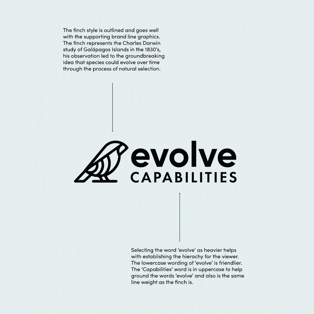
Concept Three: Making the top typeface heavier set helps with the hierarchy. The second typeface for ‘Capabilities’ has a similar line weight to the finch. Helping it look aesthetically appealing.
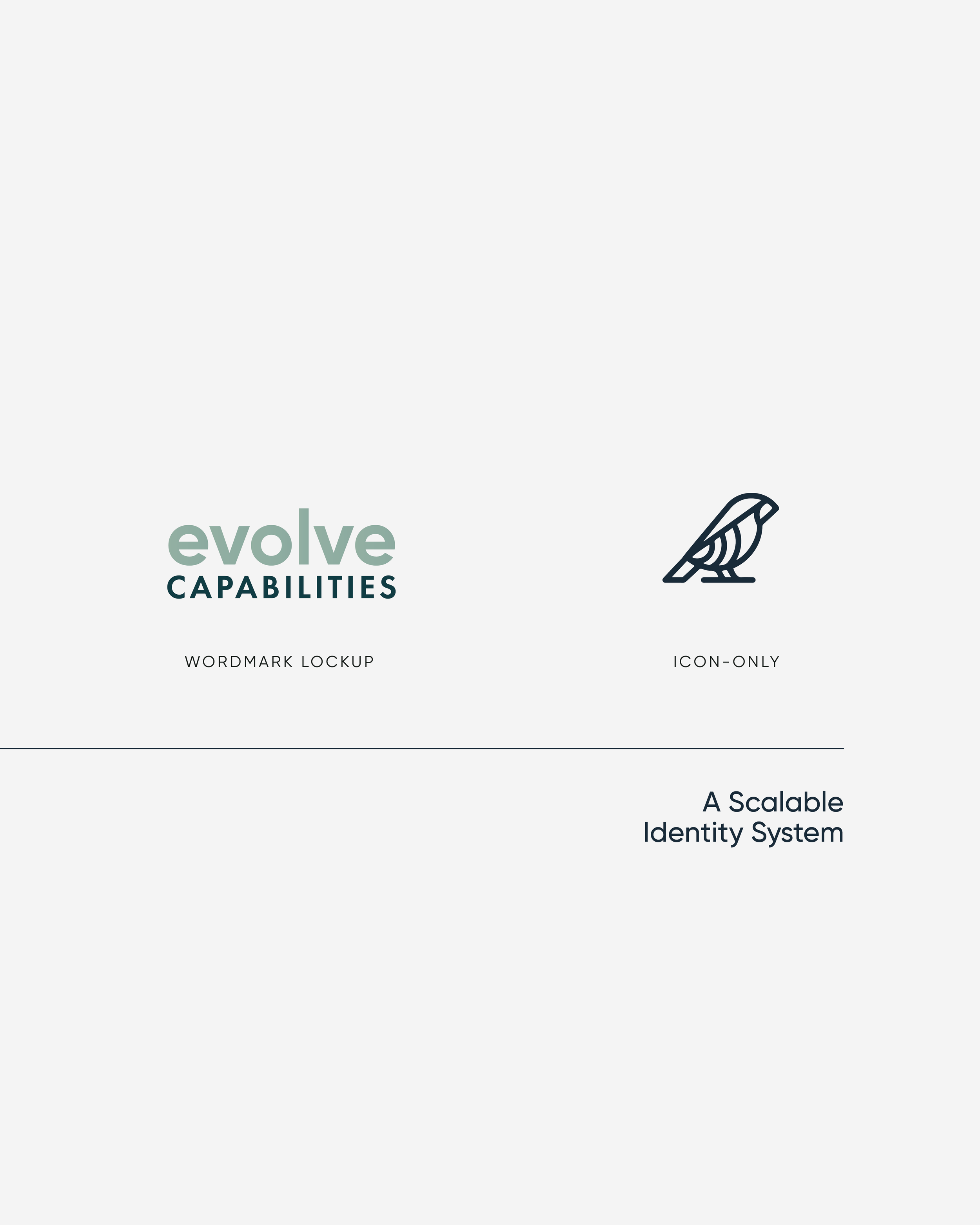
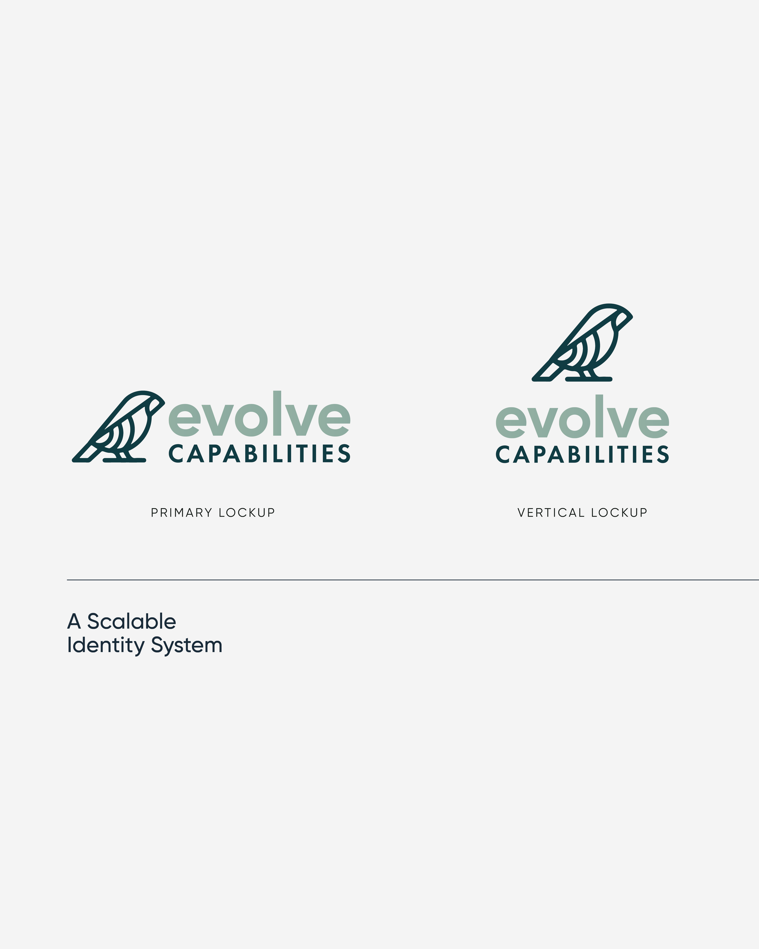
The finch is showcased in the following style which is outline. This style goes cohesively well with the supporting graphics in this concept as a line.


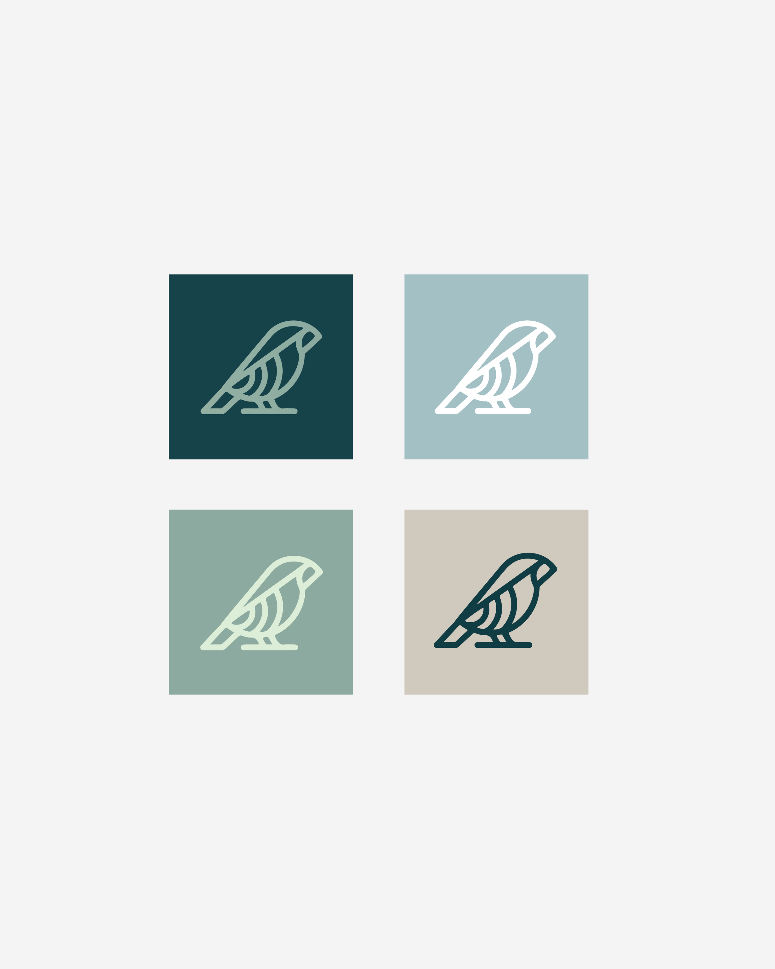


Where flowing lines represent system integration and human connection.
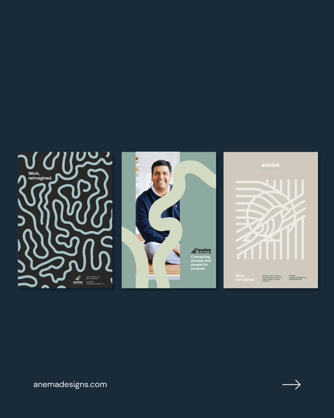
Our focus was on representing and crafting Evolve Capabilities' visual identity. This began with offering concepts, covering elements like logos, colour schemes, typography, and supporting brand graphics, including visual brand mock ups on how the brand could look applied on LinkedIn, website, and collateral. The selected final concept for the visual brand identity was the finch logo, where the lines symbolise system integration and human connections. These lines are organic to reflect the unique, quirky personalities at Evolve Capabilities, highlighting their distinctive way of questioning and thinking outside the box.
The meaning
The Finch depicted in the logo is inspired by Charles Darwin's research on the Galapagos Islands. The conclusion of this research showed how these birds evolved over time as a result of their environment.
“Charles Darwin said – “it is not the strongest of the species that survive, nor the most intelligent, but the one most responsive to change”. Evolve view business change with this in mind; innovation and disruptive changes are seen as opportunities rather than threats. Whatever it is, however, it’s meant to transform, we approach change with agility, focus, and in partnership with you.”
A scaleable identity
We developed a distinct and meaningful visual identity system that captures Evolve’s curiosity, intelligence, and human-centered approach to capability development.
Creative Direction
Provided overarching creative direction to guide the brand’s look and feel, ensuring alignment between strategic intent and visual expression. The creative direction was guided by the brand strategy.
Visual Brand Identity System
Started with brand concepts that was grounded in strategy, this than narrowed the direction down to refine the colour palette to ensure an orange was included, typographic hierarchy, logo suite, supporting graphic elements, and imagery treatment. We then developed comprehensive brand guidelines showcasing real-world applications across the website, social media templates, and collateral in order to have consistent branding across all touch points.
Where flowing lines represent system integration and human connection.

Our focus was on representing and crafting Evolve Capabilities' visual identity. This began with offering concepts, covering elements like logos, colour schemes, typography, and supporting brand graphics, including visual brand mock ups on how the brand could look applied on LinkedIn, website, and collateral. The selected final concept for the visual brand identity was the finch logo, where the lines symbolise system integration and human connections. These lines are organic to reflect the unique, quirky personalities at Evolve Capabilities, highlighting their distinctive way of questioning and thinking outside the box.
The outcome resulted in the client’s brand that truly reflected them, making it more effective to communicate to their audience.
Evolve Capabilities new branding resulting in the following feedback:
They used the Brand Guidelines (including the visuals and identity statements) to inspire a recruitment video based on their brand personality and received an overwhelming 70 applications for just two positions.
They felt we really understood the brand and captured it perfectly which has been noted by the positive response from both staff and partners.
Created a brand that represents their unique market position.
"Her talent is unmatched but it’s her passion and reliability that make her stand out."

Working with Alysha is a breath of fresh air. Her talent is unmatched but it’s her passion and reliability that make her stand out. I can always count on Alysha for any brand project to bring her all.
Hinter Agency | Creative Director Emma Sutton | Brand Strategist Defence Industry