
Courtside Fitness
Branding, Mural, Social Media and Marketing
Warwick Fitness underwent a successful rebranding to Courtside Fitness, achieving substantial growth through strategic branding initiatives. The comprehensive project included the revitalisation of the visual identity, extending to print and digital collateral, such as website and social media assets, alongside the creation of five impactful hand-drawn artwork murals. As Courtside Fitness is located next to Warwick Basketball stadium, having strong ties in the sense that they provide.
-
Brand Identity, Mural Design, Social Media and Marketing
-
Courtside Fitness
-
Fitness Industry
-
Gym , 1:1 Training, Group Training, Specialist Training, Programs
-
Anema Designs collaborated with LUSH
-
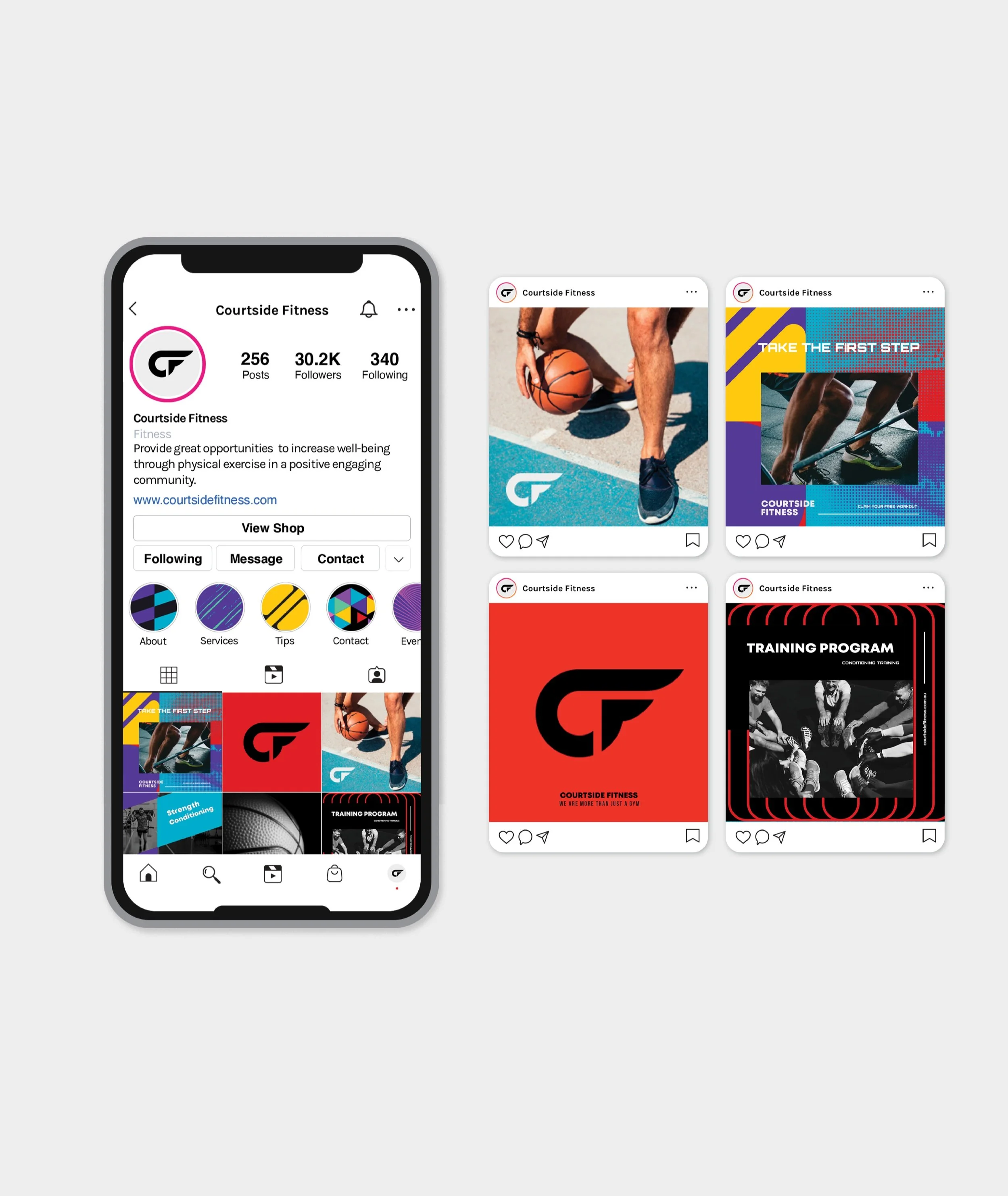
Comprehensive visual brand identity (logo suite, moodboard, colour palette suite, typography suite, typography hierarchy, brand supporting graphics, brand imagery, brand style guideline 20+ pages), social media templates, website design, mural illustrations and design for five impactful walls.

Performance-led brand inspired by basketball culture, built for movement.
We partnered with LUSH to transform Warwick Workout gym into Courtside Fitness, a complete rebrand that redefined not just the look, but the purpose of the space. The project brought together two strong capabilities of illume, branding and illustration, making it a dream collaboration.
From the outset, the vision was clear: to create a dynamic, purposeful brand that reflects the gym’s focus on athletic performance and personal growth. Courtside Fitness isn’t just about workouts, or ‘just a gym’ it’s about developing every individual to reach their optimal potential through consistent support and training. The rebrand sought to capture that mindset, turning a traditional gym into a community that champions movement, motivation, and progress. As Courtside Fitness is connected to a basketball stadium, the developing athletes aspect is a strong purpose and differentiator.
Before the transformation, the gym faced familiar challenges:
Lack of differentiation – visually, it blended in with competitors, offering no clear reason for potential members to choose it.
Limited appeal - without a strong identity, it struggled to connect with a specific audience seeking performance-driven fitness.
Engagement challenges - the brand lacked the energy and atmosphere needed to build a vibrant, loyal community and the key target audience they where aiming for.
We approached the rebrand by drawing on illume founder, Alysha’s deep personal connection to basketball. She had played at a State level, been offered the opportunity to attend college basketball in the U.S., and spent countless hours training daily, Alysha knew the sport inside and out. Basketball wasn’t just a game, it was a way of life for a season of life. Growing up, she and her brother collected magazines and trading cards featuring legends like Michael Jordan, Scottie Pippen, Shaquille O’Neal, and Charles Barkley.
Having had this background and experience, it definitely informed and assisted the rebrand and the storytelling graphics to the mural concepts, grounding the rebrand in authenticity and movement. We explored bold, dynamic colours and geometric patterns reminiscent of court markings and ball textures, inspired by major athletic brands like Nike and Adidas, but reinterpreted to align with Courtside Fitness’s unique identity and performance-driven focus.


Visualising Performance
The rationale behind the logo became a core expression of movement, creatively merging the letters ‘C’ and ‘F’ into a form that evokes the motion of a ball. It symbolises energy, flow, and forward momentum, everything the gym rebrand stands for moving forward in performance and as an athelete.
To bring this energy into the physical space, we designed illustrated storytelling graphics and had murals featuring vibrant geometric shapes layered against black-and-white portraits of sporting legends such as Muhammad Ali and Kobe Bryant. The contrast between the vivid patterns and monochrome figures created a striking, motivational atmosphere that resonates with both new and long-time members. All imagery was treated and responsibly licensed using creative commons licences, ensuring the visuals felt cohesive, professional, and full of life.
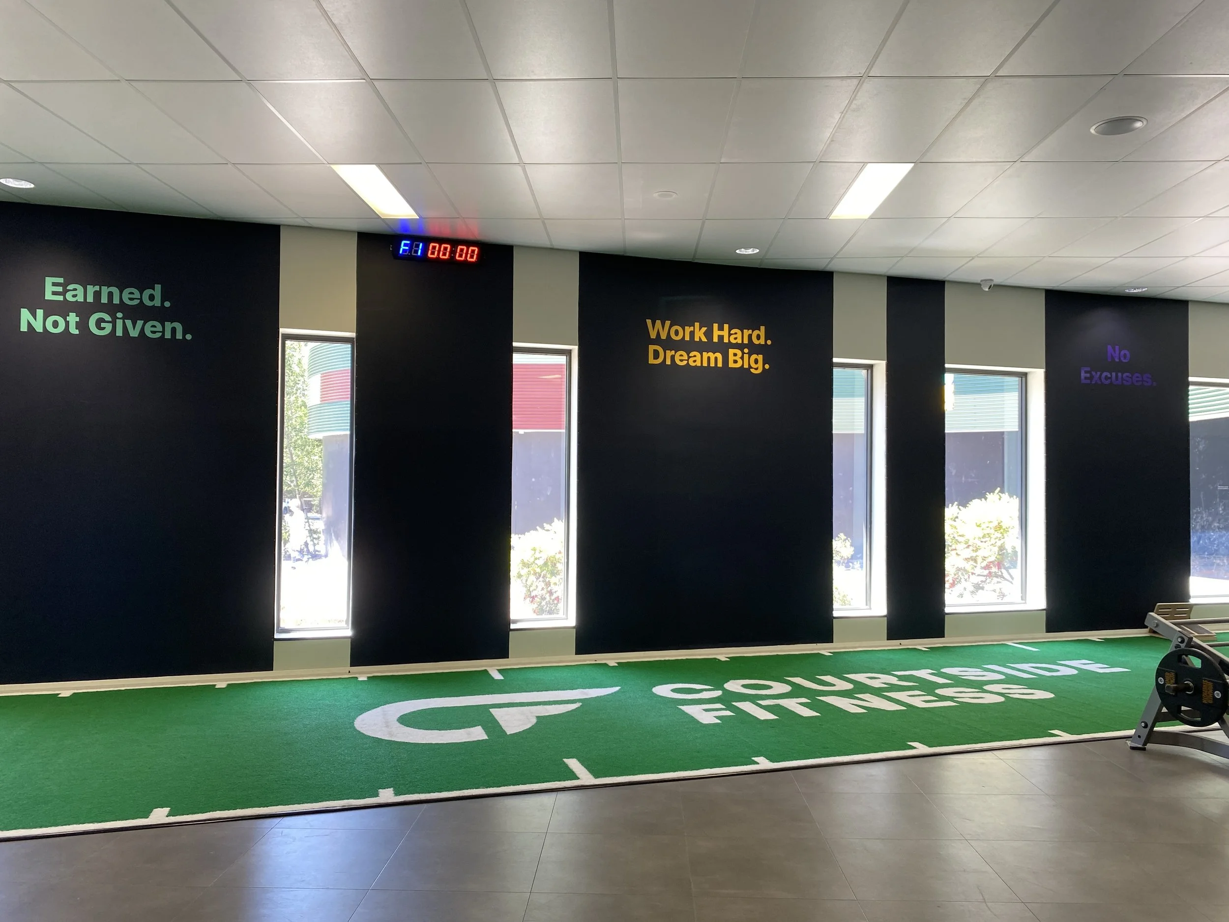

Courtside Fitness introduced green turf featuring the new Courtside Fitness logo, adding to the dynamic, performance-driven feel of the rebrand. The turf brings a sense of energy and movement to the gym floor, a visual cue that aligns with the brand’s focus on athletic development. Outside, flag signs were installed to draw attention and intrigue, extending the visual identity beyond the building and creating a cohesive experience from the street to the training floor.
The transformation positioned Courtside Fitness to connect with a new target audience focused on athletic performance, while still welcoming existing members who value traditional gym training.
What we did
We revitalised Courtside Fitness’s visual identity to reflect its athletic, performance-based ethos and connect more deeply with its community.
Creative Direction + Concept Development - established the visual tone and layout
Visual Brand Identity - explored bold, dynamic colours and geometric patterns reminiscent of court lines and ball textures, reinterpreted to suit the Courtside Fitness brand.
Logo Design - combined the letters ‘C’ and ‘F’ into a fluid, motion-driven mark that captures the rhythm and pace of athletic movement.
Graphic Storytelling + Mural Illustrations – designed vibrant, geometric backdrops featuring black-and-white portraits of sports icons like Muhammad Ali and Kobe Bryant, creating contrast and inspiration.
Graphic Adaptation - repurposed key elements from the main visual system for consistency across apparel, signage, and in-gym touchpoints.
Artwork Delivery - prepared and exported all final graphics in relevant file formats, ensuring quality and usability across print and digital applications.
Supporting Graphics – developed a suite of versatile assets, including icons, textures, and visual motifs for consistent use across platforms.
Colour Palette + Typography – crafted a vibrant palette and strong typographic hierarchy to reinforce movement, strength, and accessibility.
Social Media Templates – created ready-to-use layouts to ensure visual consistency and brand recognition across online content.
Website Design – website design /wireframe that reflects the new brand identity, improving user experience and new focus areas. This enabled the web developer to apply it.
Brand Guidelines - documented design standards for logo usage, colour application, and typography to maintain cohesive implementation.
Graphic Adaptation – repurposed key design elements for apparel, signage, and other event collateral.
Brand Application – provided mockups/designs of how the brand will be applied onto t-shirts, lanyards, and website.
Artwork Delivery – prepared and exported all final assets in the necessary file formats for both print and digital use.
Six to eight months after the rebrand, Courtside Fitness had experienced tangible results and renewed momentum.
The refreshed identity reinforced their mission to deliver an athletic, performance-driven environment where members are empowered to become their best.
According to the manager, the gym achieved growth during the winter months - a rare feat in the fitness industry - and has maintained strong performance since. The team believes the rebrand will deliver a clear return on investment, with the new look helping to engage both current and prospective members, particularly through the impact of the exterior mural.
The consistent visual identity across all touchpoints has boosted trust and recognition, helping Courtside Fitness stand out in a very generic and crowded market of gyms. It’s no longer “just a gym,” it’s a brand that people want to be part of, that is been taken notice. The transformation created more than a look; it built a sense of community, belonging, and momentum that continues to grow with each season.