Embrace Physio
Brand Identity
Embrace Physiotherapy is a dedicated women’s health physiotherapy clinic in Singapore focused on supporting women through all stages of life—from menstrual health to pregnancy, postpartum recovery, menopause, and beyond. Their all‑female team offers a range of services including women’s health physiotherapy, pre‑ and postnatal care, lactation support, birth preparation, general physiotherapy, massage therapy, clinical Pilates and exercise, small group classes, and telehealth options. They treat conditions such as pelvic floor dysfunction, diastasis recti, pelvic pain, endometriosis, prolapse, musculoskeletal pain, and menopausal changes, helping clients build strength, confidence, and long‑term wellbeing. Embrace combines personalised assessment and tailored treatment with education and supportive group programs in a welcoming, judgement‑free environment
-
Brand Identity
-
Embrace Physio
Women's Health Physiotherapy
Pelvic Floor Physiotherapy
Pregnancy (Antenatal) Care
Postnatal Rehabilitation
New Mum Assessments
Gynaecological Physiotherapy
Pelvic Pain Treatment
Continence & Prolapse Management
Education & Rehabilitation Programs
-
Health & Wellness
-
Women's Health Physiotherapy / Allied Health
-
-
Brand Strategy
Brand Identity
Logo Design
Colour Palette
Typography
Custom Illustration
Iconography
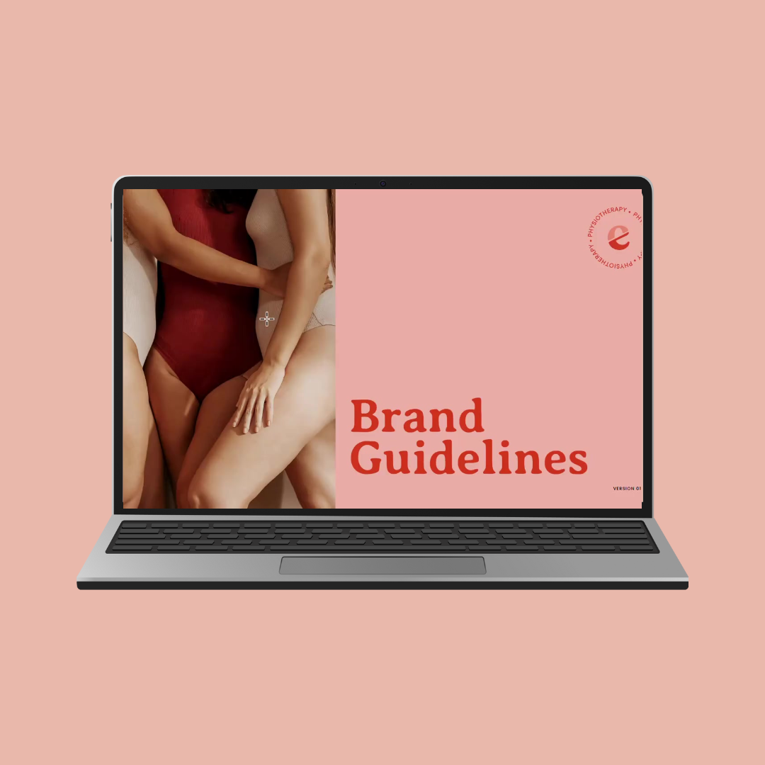
Brand Guidelines
Marketing Collateral
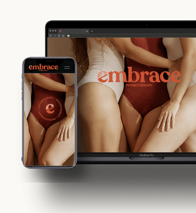
Website Visual Assets
Copyrighting
Messaging
Embrace approached us to help establish a distinct brand identity that reflected their focus on women’s health.
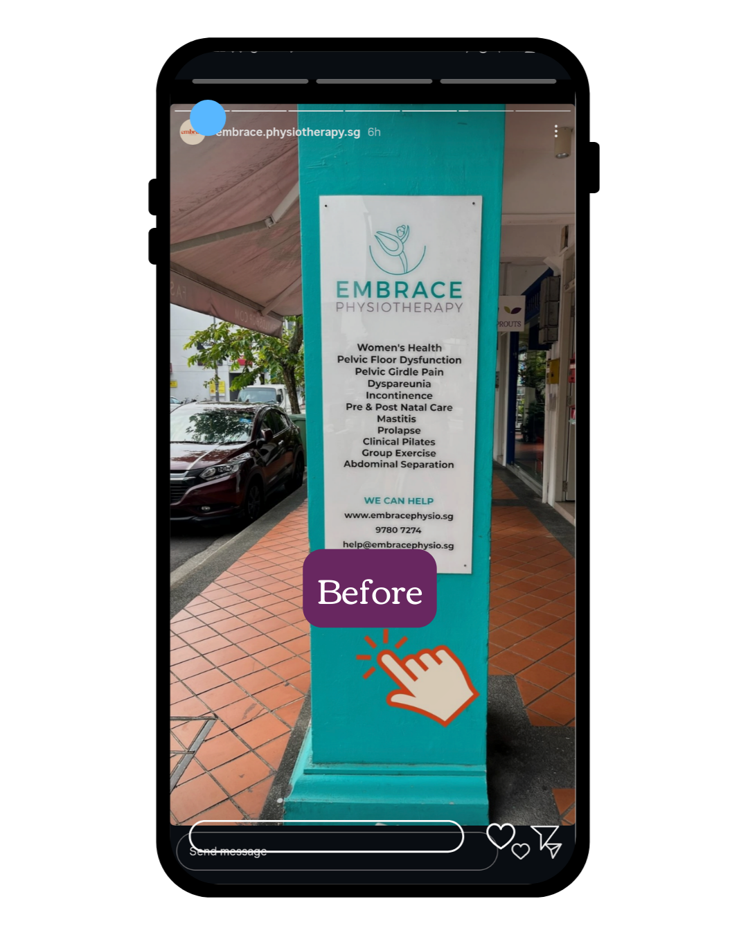
Embrace approached us to help establish a distinct brand identity that reflected their focus on women’s health. Previously, their messaging and visual identity were broad and generic, aligning with standard health clinic with a broad target audience, with dominate dominated by light teal greens. The goal was to create a brand that felt unique, authentic, and resonated with women across different health journeys and the services, and the bold approach embrace physio.
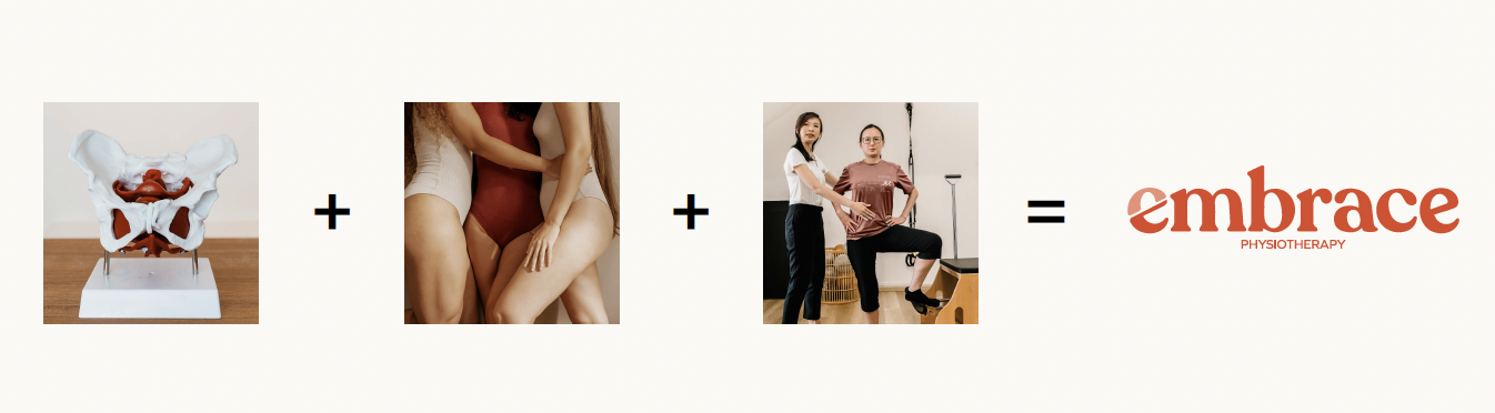
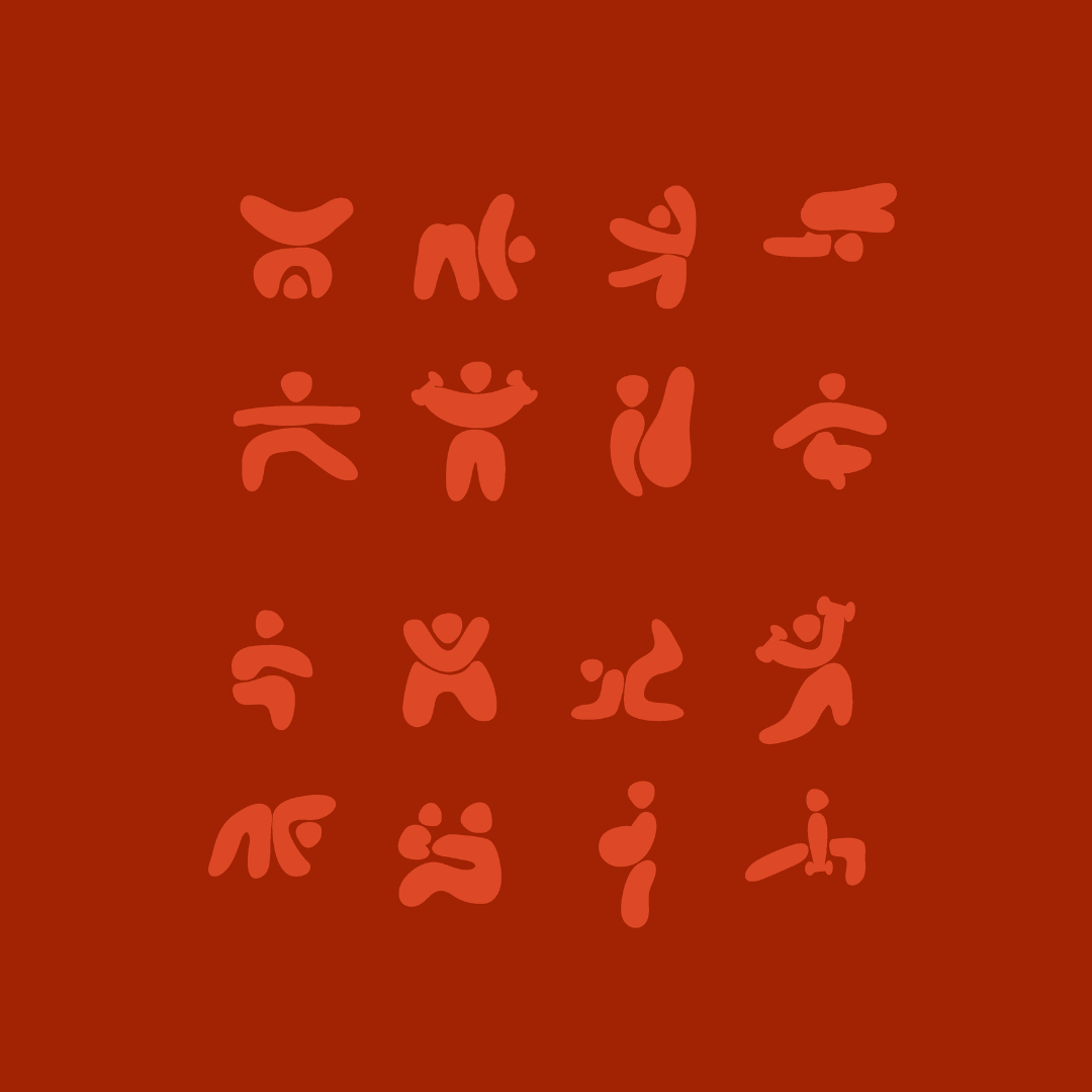
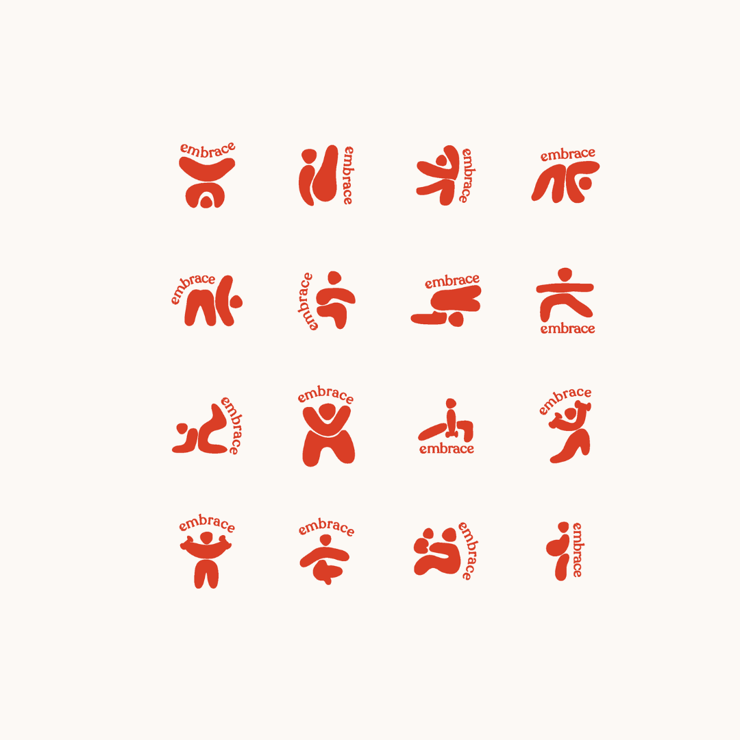
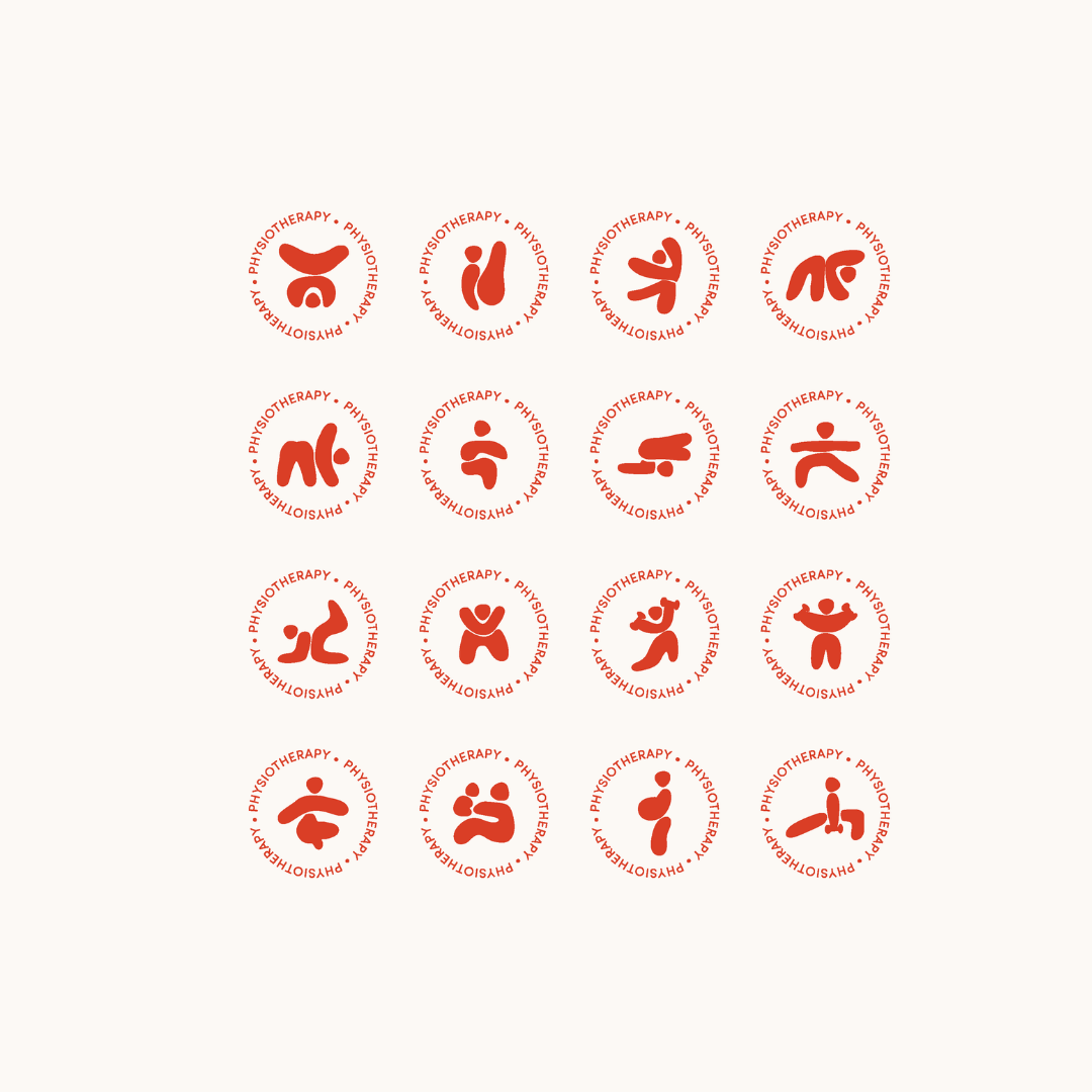
We began by exploring three creative directions. While the first two did not fully capture the vision, the third direction brought us closer to the desired outcome. Using organic illustrations of different body positions and diverse body shapes, we developed a concept where the letter "E" symbolically represented both the pelvic region and the essence of Embrace.
To ensure alignment between visuals and messaging, we collaborated with a copyright and brand messaging specialist. This approach ensured that every element, from typography to imagery, communicated the brand’s values harmoniously.
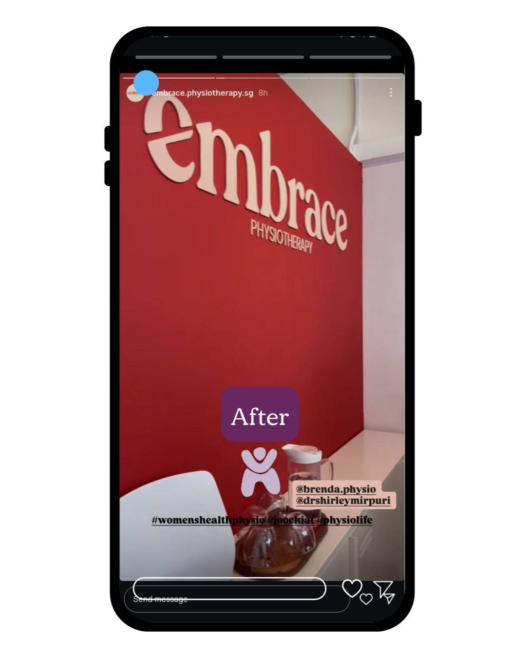
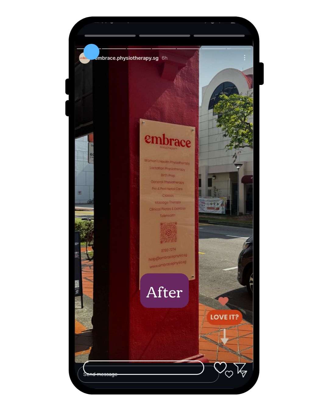
Colour Palette: Terracotta tones, warm whites and creams, with contrasting purples to break away from conventional health-industry colours.
Typography: Organic, approachable, and carefully selected in collaboration with the Embrace team.
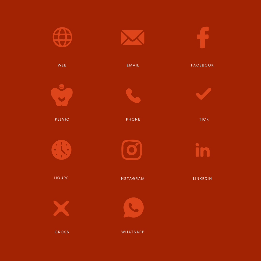
Iconography & Logo Suites: Developed primary, secondary, tertiary, and alternative icons to ensure versatility across applications.
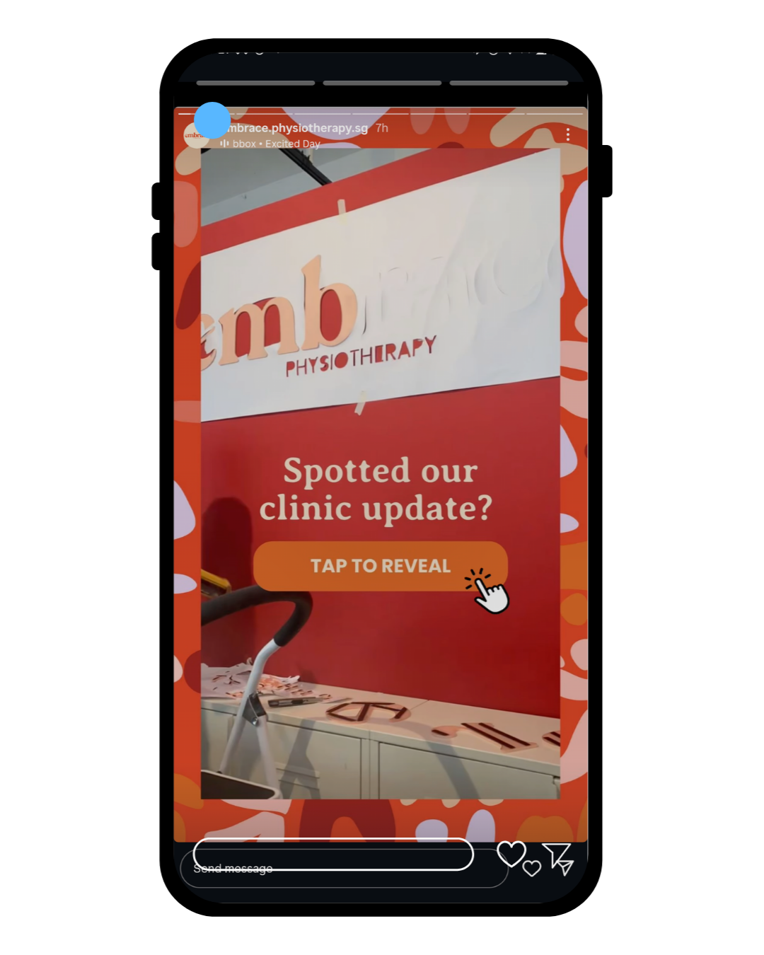
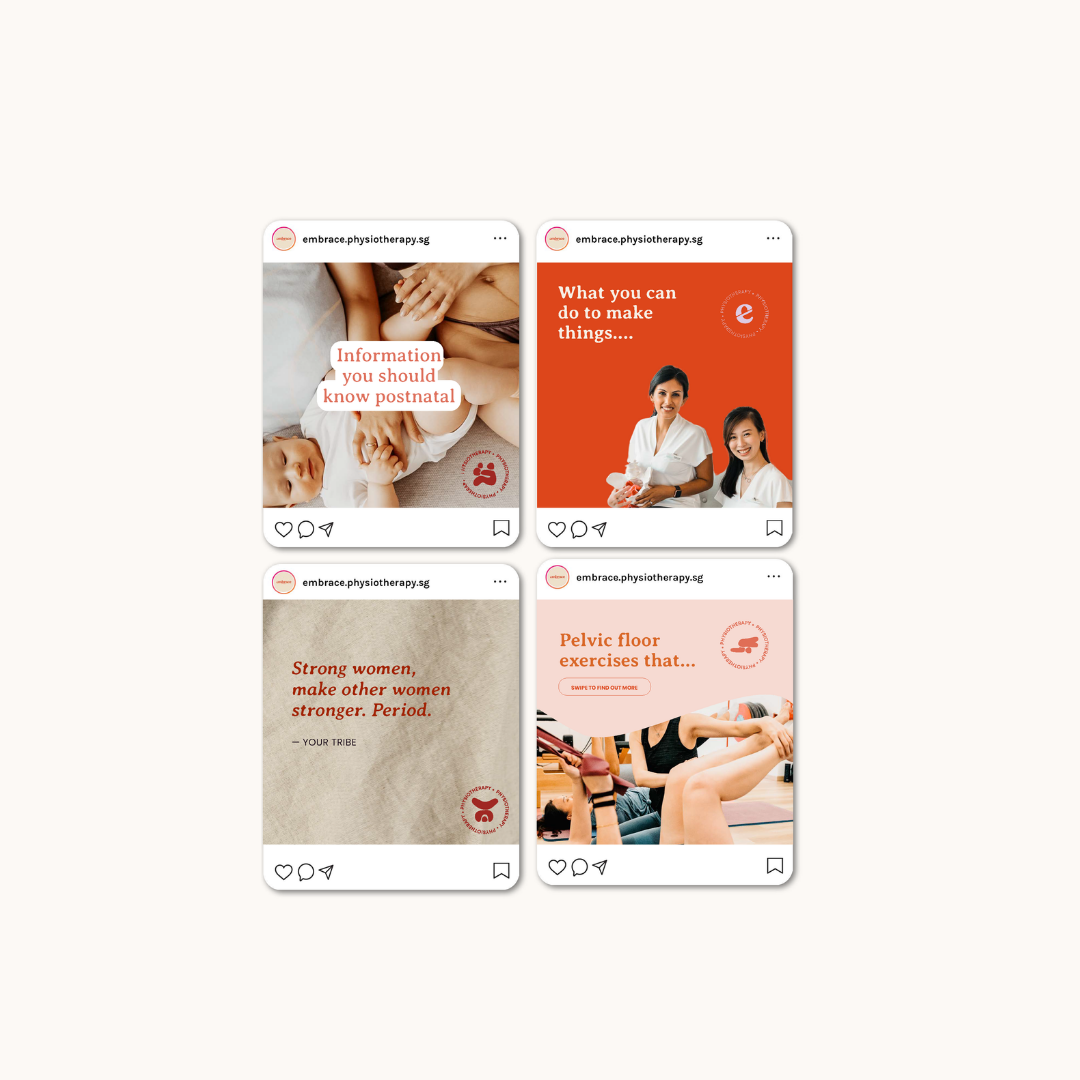
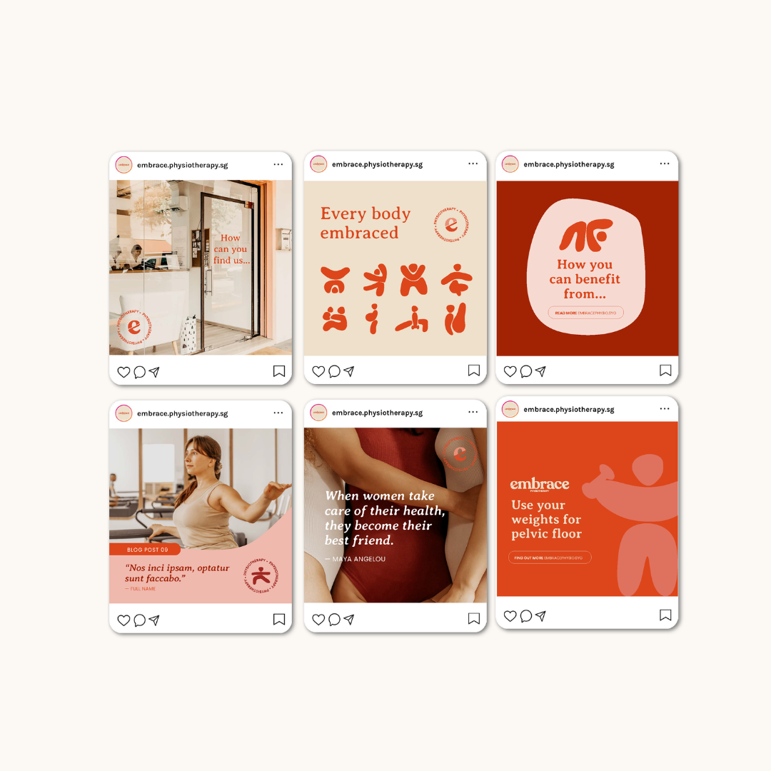
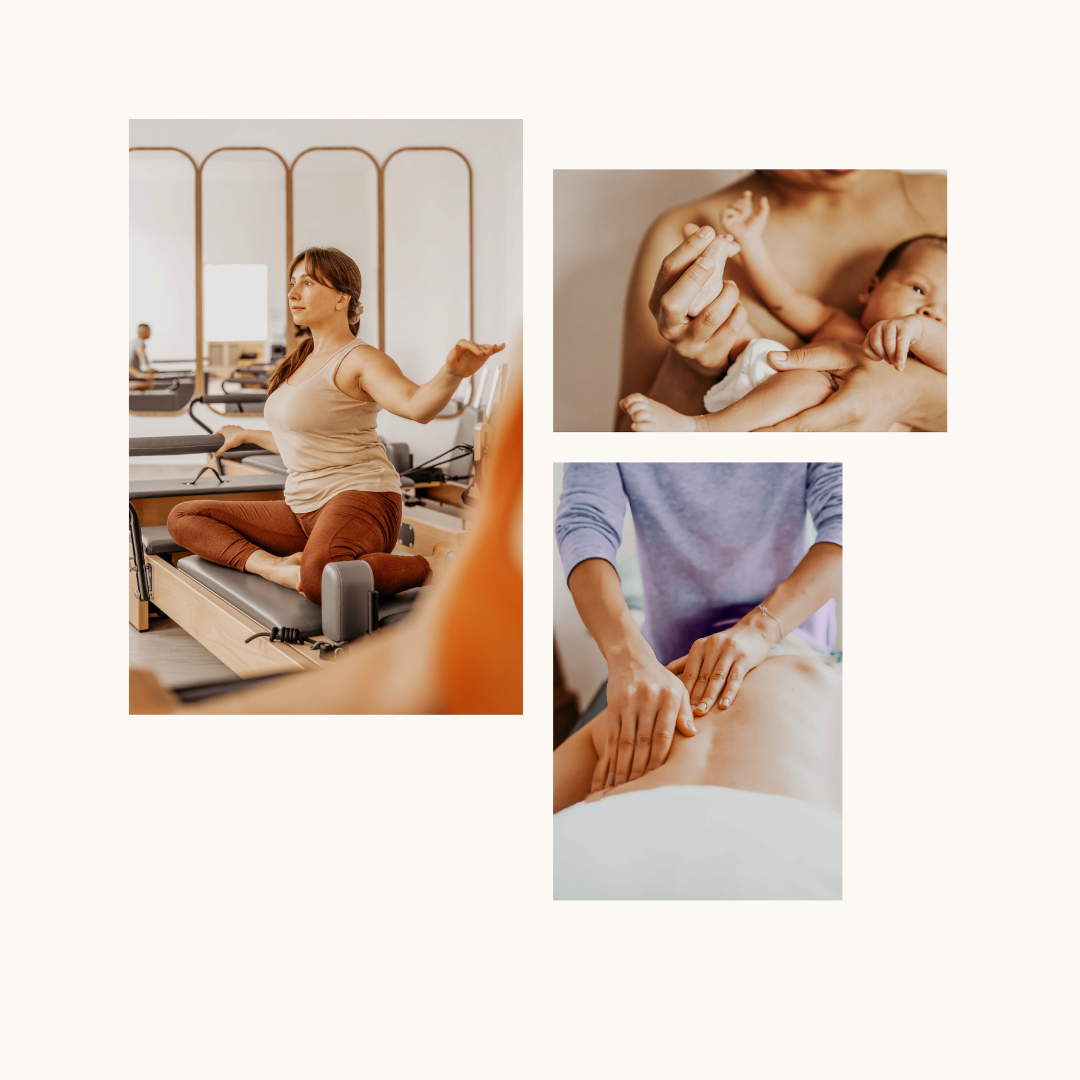
Photography: Over 100 existing photos were edited to align with the new brand palette, replacing greens with terracotta tones. Additional brand photography was sourced to maintain a cohesive visual tone.
We translated the new identity across multiple touchpoints:
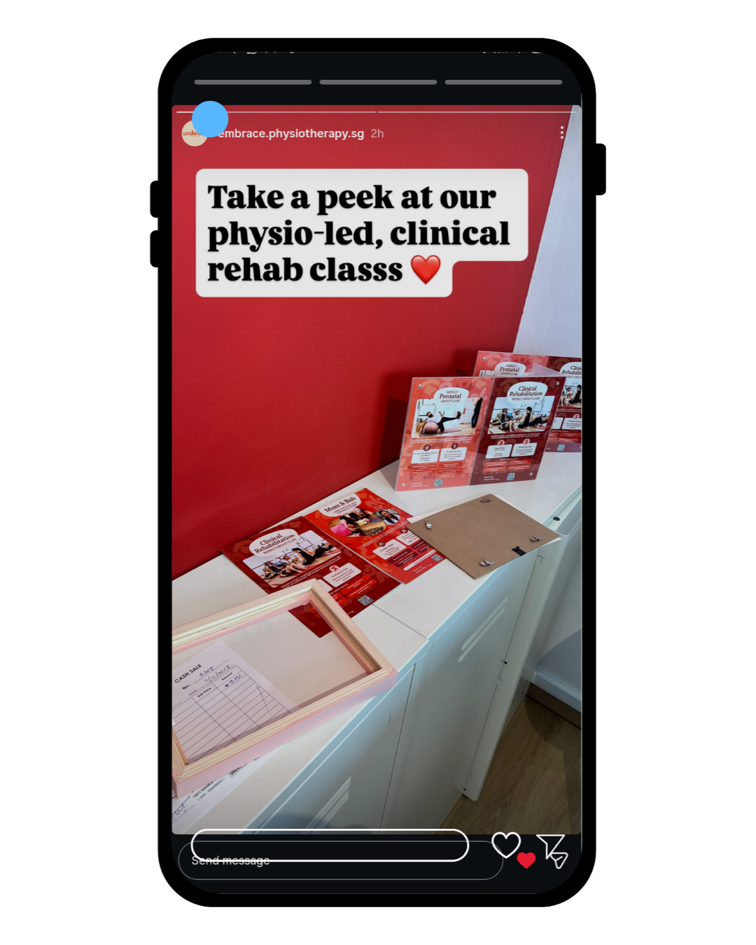
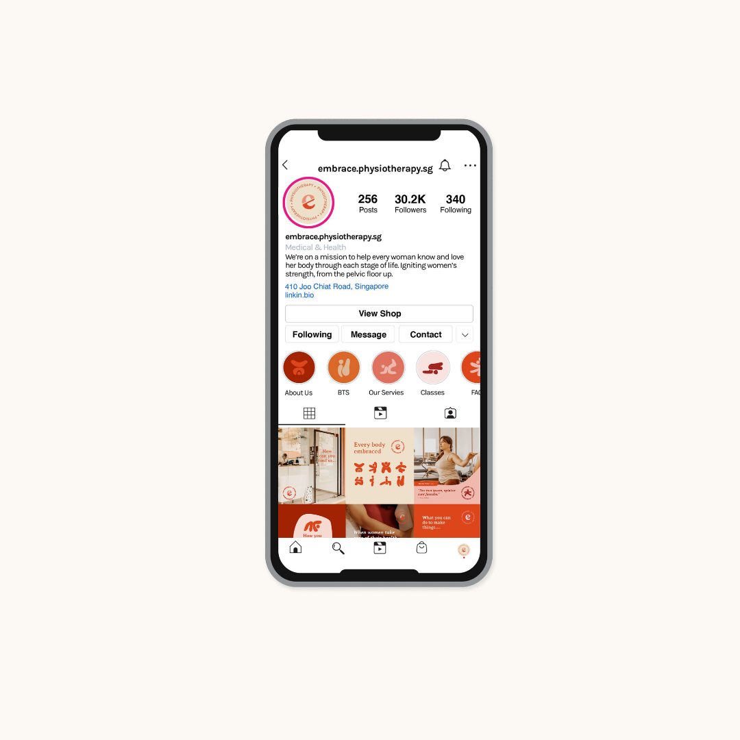
Over 20 social media templates, including posts and stories, designed to simplify content creation while remaining true to the brand’s voice.
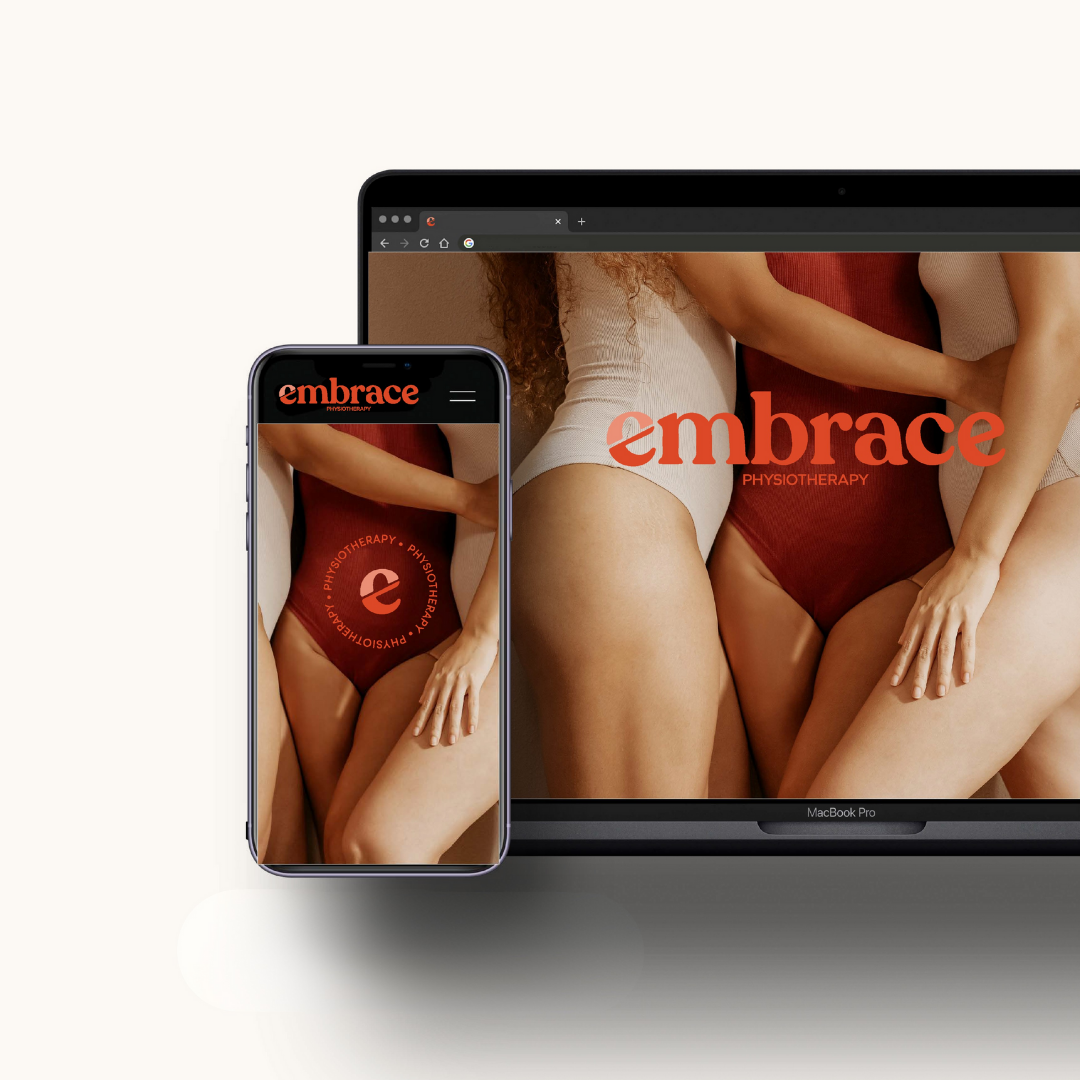
Website support, including photography and visual elements, to maintain consistency across digital channels.
Signage and environmental applications to help Embrace present a professional and visually consistent identity in their physical spaces.


The new branding enabled Embrace to clearly define and communicate its focus on women’s health, differentiating it from generic health clinics.
The overall messaging and brand visual identity is very bold, especially in the Singapore marketplace where women’s health isn’t spoken such broadly about. With the comprehensive brand assets and templates, the client has:
Streamlined marketing and content creation processes
Expanded their team and operational capabilities
Confidently applied the brand across physical and digital touch points across all assets, including signage.
The result is a visually cohesive, meaningful brand identity that resonates with Embrace’s target audience and reflects the clinic’s mission to support women throughout their health journeys.
-
![Transformation]()
Transformation
-
![Before Signage]()
Before Outdoor Signage
-
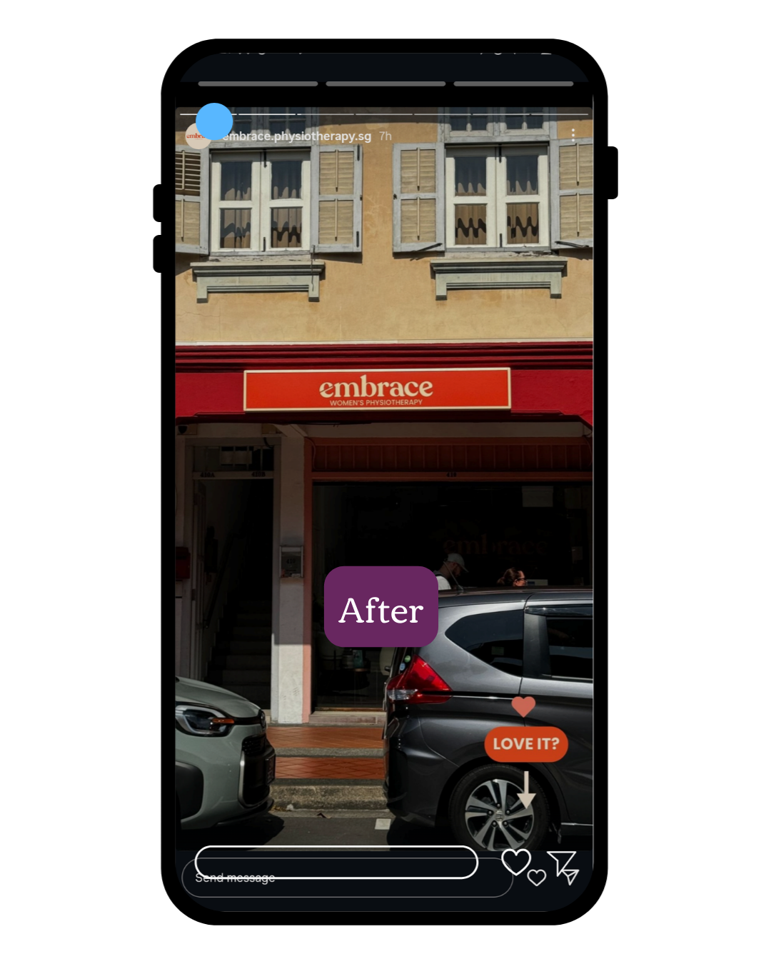
![After]()
After Outside Signage
-
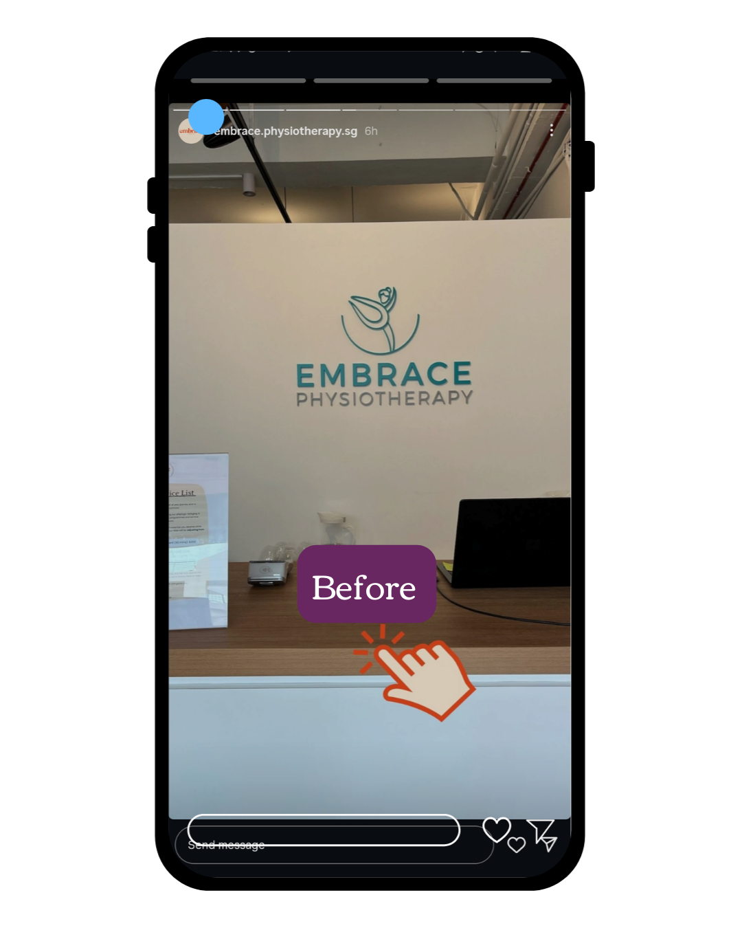
![Before Inside]()
Before Inside Signage
-
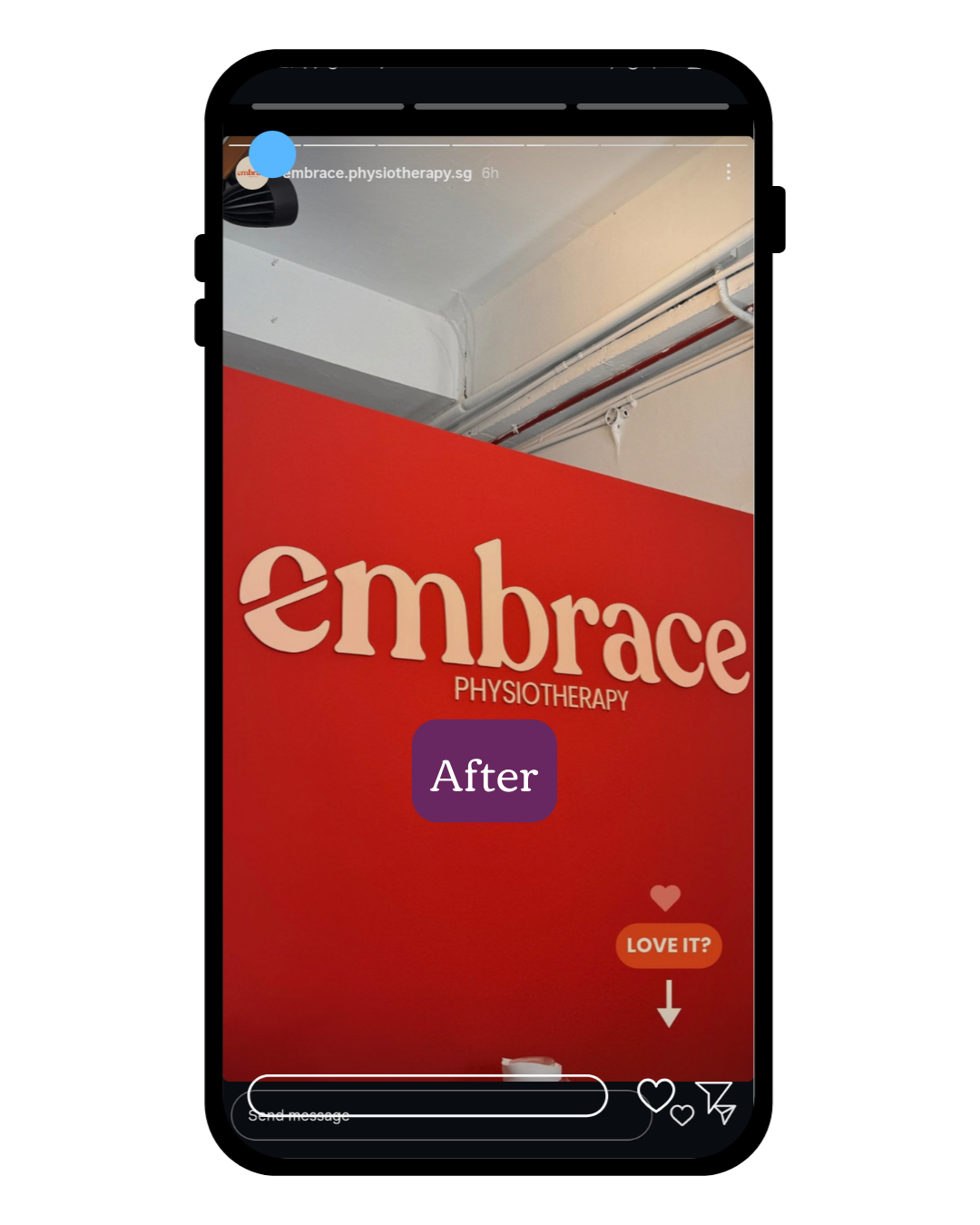
![After Inside Signage]()
After Inside Signage
-
![After Inside]()
After Inside Signage
-
![]()
Before Pillar
-
![]()
After Pillar
-
![]()
Print Collateral